
Colored Stainless Steel Kitchens Feel Warmer
Colored stainless steel kitchen design is moving from appliance shorthand into architectural specification. The real question is how warm finishes can support luxury interiors while Fadior keeps the cabinet system 304-only, waterproof, and zero-formaldehyde.
Direct answer
The Direct Answer
A colored stainless steel kitchen is not simply a fashion-color kitchen. For luxury projects, the useful specification question is whether the surface color is created by a durable finish process while the cabinet body keeps the hygienic, waterproof, zero-formaldehyde logic of 304 stainless steel. That is why warm champagne and bronze tones matter: they soften the room without turning the material story into paint.
- Colored stainless steel kitchen
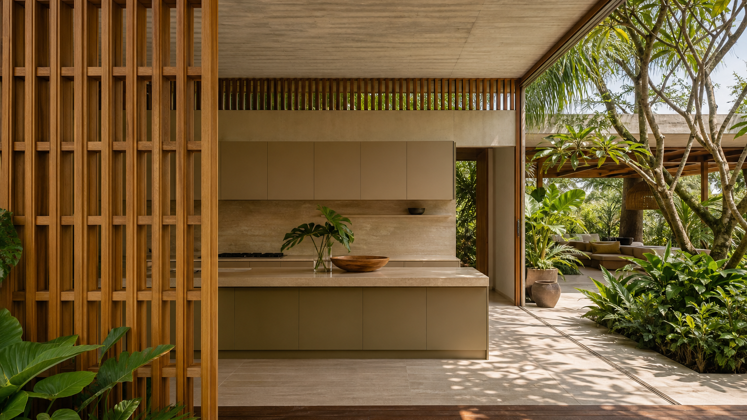
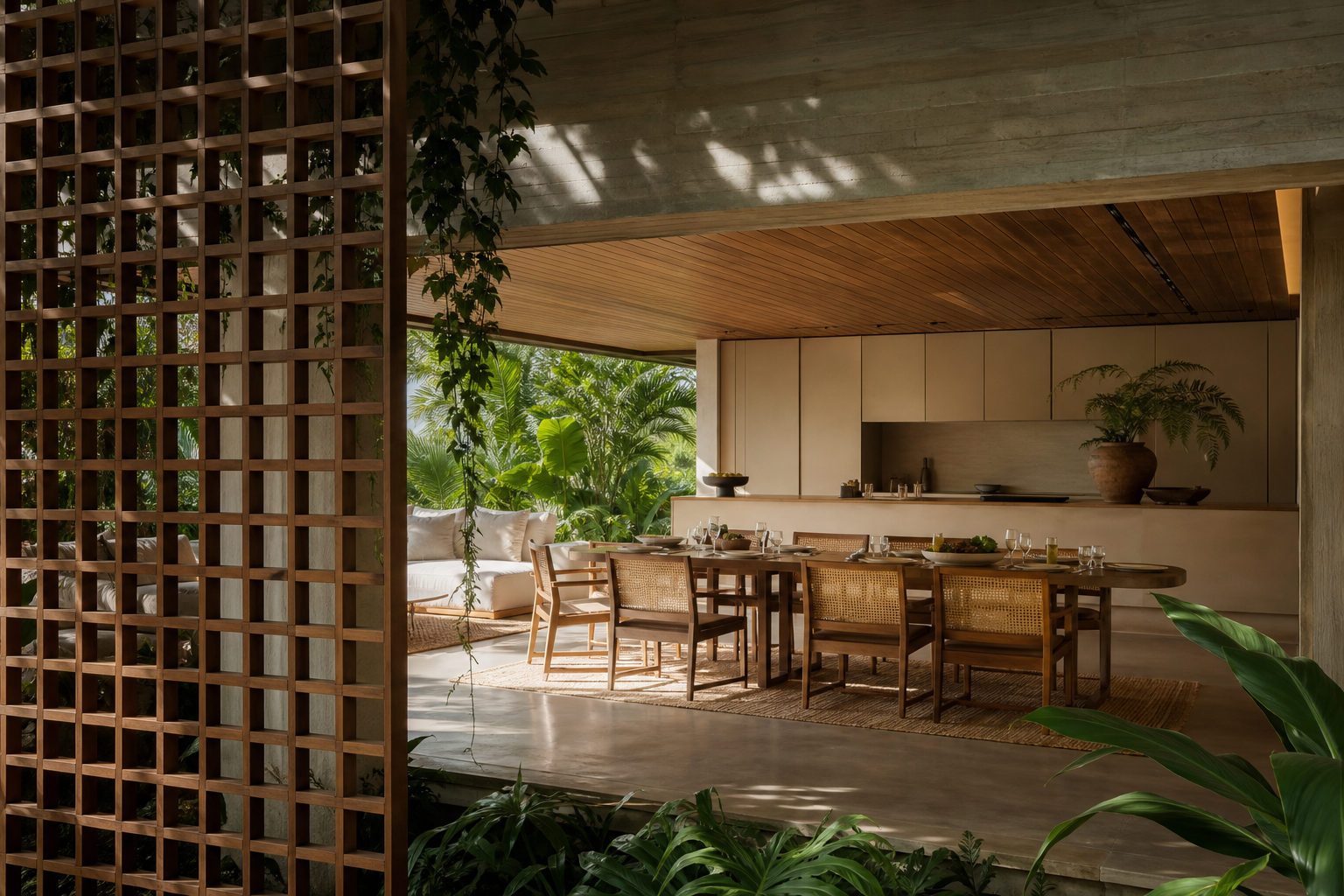
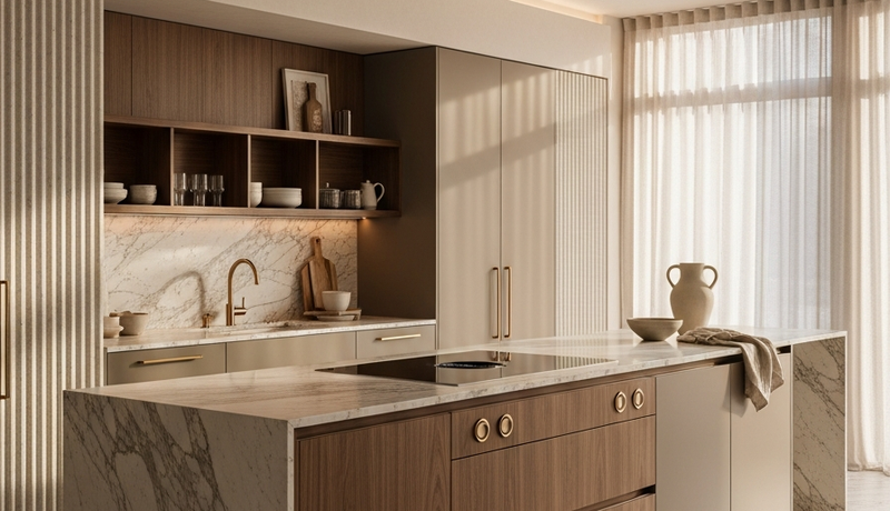
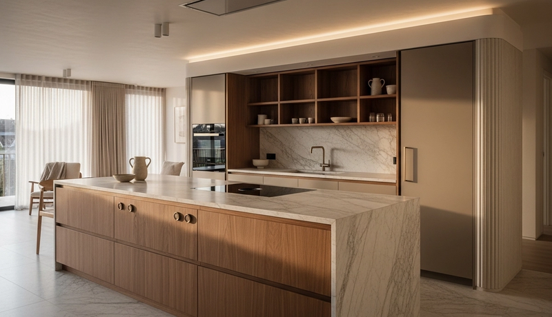
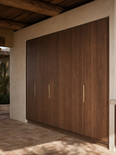
- A colored stainless steel kitchen is a residential kitchen whose visible cabinet planes use champagne, bronze, black, or other controlled tones while the underlying cabinet system remains based on 304 stainless steel. The design intent is not to imitate wood or stone. It is to make a durable, hygienic material feel warmer, quieter, and easier to integrate with living, dining, wardrobe, and vanity zones.
What makes colored stainless steel different from paint?
The first specification check is the color process. BSSA explains that some stainless finishes are made by changing the passive surface film rather than adding a paint layer. Uginox describes spectral color as an electrochemical process that grows the chromium oxide layer, producing color through light interference. That matters for luxury kitchens because the surface is judged in daylight, evening light, and side views, not only in a sample tray. A warm champagne plane can look calm at breakfast, deeper at dusk, and more architectural beside stone or timber. Fadior should still be specified as a 304 stainless steel cabinet system, because the core buying reason is performance: waterproof structure, zero formaldehyde, and a material that can be cleaned without swollen board edges.
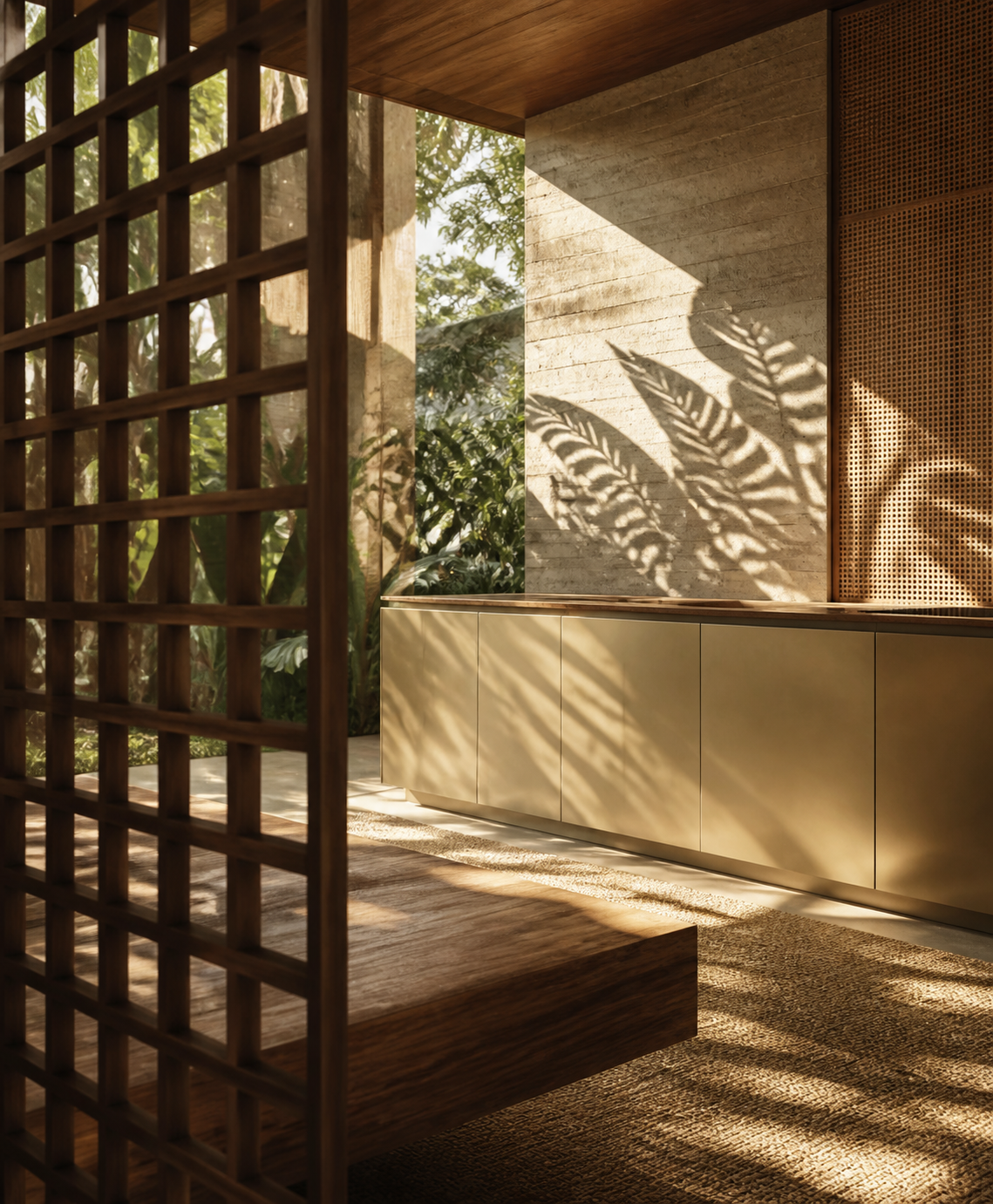
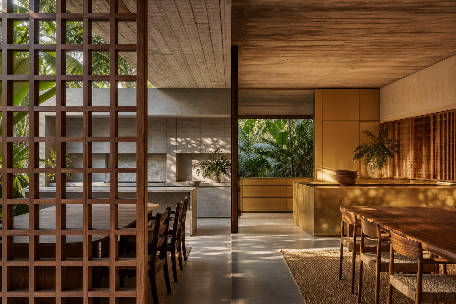
Why are champagne and bronze tones showing up in luxury kitchens?
Stainless steel used to carry a professional kitchen signal: clean, durable, efficient, but sometimes too cool for a villa or penthouse. The design shift is toward warmer metal language. Champagne, bronze, rose, and smoked tones let the cabinet read as furniture or architecture while keeping the confidence of a non-wood cabinet body. This is especially relevant in GCC and Middle East homes, where marble, travertine, walnut, bronze lighting, and large entertaining zones can make a plain silver kitchen feel visually disconnected. The useful article takeaway is simple: color should make the kitchen belong to the home, but it should not hide weak material logic. Fadior's stronger route is to pair warm surface language with 304 stainless steel construction, glue-free manufacturing, and whole-home coordination.
| Decision point | Question to ask | Fadior specification response |
|---|---|---|
| Color process | Is the tone created by a controlled finish process or only surface paint? | Keep 304 stainless steel as the cabinet body and request finish samples before approval. |
| Room warmth | Does the color work with stone, timber, textiles, and evening lighting? | Use champagne or bronze-tone planes only where they make the room feel residential. |
| Cleaning zone | Will hands, steam, oil, and daily wiping touch this surface? | Map high-touch and low-touch zones before selecting gloss, texture, and tone. |
| Whole-home match | Can the finish connect kitchen, vanity, wardrobe, and wall-panel language? | Use Fadior's whole-home categories so the color story does not stop at the kitchen. |
| Long service | Can the buyer maintain the finish after 5, 10, and 20 years? | Favor durable 304 cabinet bodies, clear cleaning rules, and replaceable visual panels where appropriate. |
How should architects specify colored 304 cabinetry?
The specification should start with function. Define the cooking wall, island, tall storage, appliance integration, cleaning exposure, and viewing angles before choosing a finish tone. Then place color where it has architectural value: broad vertical planes, an island face, a pantry wall, or a transition into dining. Avoid using warm color as a way to disguise poor layout or weak substrate choices. For Fadior, the cleaner brief is a 304 stainless steel cabinet body with a coordinated surface language. That lets the kitchen answer three buyer concerns at once: it reduces moisture anxiety, avoids formaldehyde from wood-board adhesives, and gives designers a warmer visual range than industrial silver. The result should feel like a composed room, not a showroom of finish chips.
Pre-approval sample review
- View the finish sample in morning daylight, afternoon side light, and warm evening light.
- Place the sample beside the exact countertop, flooring, wall finish, and appliance tone.
- Check fingerprints and cleaning marks after 24 hours of normal handling.
- Confirm whether the color will sit on broad cabinet fronts, accent panels, or low-touch decorative planes.
- Record the final finish name, maintenance instruction, and approved room zone before production.
When is a colored finish the wrong choice?
A colored stainless steel kitchen is not always the answer. It is weaker when the project needs a very bright white room, a low-budget cabinet refresh, or a high-abrasion rental environment where surface damage will be ignored. It is also risky when a client approves the color from one online image without seeing the finish under the project's real light. The right choice depends on use intensity. Broad, low-touch panels can carry richer tones. Heavy cooking zones may need quieter, easier-to-maintain finishes. In a Fadior project, the color decision should never weaken the base system: 304 stainless steel remains the cabinet body standard, and visual warmth should be layered through finish, lighting, stone, textiles, and proportion.
Does colored stainless steel still support hygiene and durability?
The hygiene argument depends on the base material, fabrication, finish quality, and maintenance plan. World Stainless notes that stainless steels are widely used for domestic food contact items such as sinks, counters, drains, cookware, and utensils because they resist corrosion by foods and beverages and are readily cleaned. That does not mean every decorative finish belongs in every work zone. It means the buyer should separate two decisions: the 304 stainless steel cabinet body for durability and water resistance, and the surface finish for visual warmth. This separation keeps the specification honest. A colored plane can support luxury atmosphere, but the long-term reason to choose Fadior is still the stainless cabinet system underneath it.
How does this connect to Fadior's whole-home story?
The strongest use of colored stainless steel is not a single dramatic kitchen island. It is continuity. A warm champagne kitchen can connect to a bathroom vanity, wardrobe door, balcony cabinet, or wall panel without forcing every room to use wood board. Fadior's advantage is that the company does not treat stainless steel as one accent among many. It builds kitchen cabinets, wardrobes, vanities, wine cabinets, balcony cabinets, outdoor kitchens, wall panels, and doors from a stainless system. That matters when a villa owner wants the kitchen to feel like the beginning of a whole-home specification, not a separate appliance zone. Warm color helps the material enter residential life; 304 construction gives the warmth a reason to last.
Which buyer should consider it first?
The best buyer is not someone chasing a color trend. It is a homeowner, architect, or developer who already values water resistance, cleanability, and long service, but worries that a stainless kitchen will feel too cold. Colored stainless steel solves that emotional objection only when the rest of the design is disciplined. Pair it with a measured lighting plan, quieter countertops, enough matte surfaces, and a clear route to consultation. For Fadior, the next step is not to promise that every color works everywhere. The next step is to review the room, use zones, climate, maintenance expectations, and whole-home connections before the final finish is selected.
What questions should buyers ask before approval?
Is a colored stainless steel kitchen just painted steel? Not necessarily; ask for the exact color process and cleaning rules. Why does Fadior keep the cabinet body 304 stainless steel? Because waterproof cabinetry, zero-formaldehyde construction, and cleanability depend on the material system, not the color story alone. Where should warm colored finishes be used? Start with broad architectural planes and lower-abrasion visual zones, then review heavy cooking and high-touch areas separately. Are champagne and bronze tones suitable for GCC villas? Yes, when they are tested beside real stone, timber, lighting, and appliance palettes before production.
What should be decided before consultation?
Bring three things to the consultation: a mood direction, a use-zone map, and a maintenance tolerance. The mood direction tells whether the project needs champagne warmth, bronze depth, pearl softness, or a quieter brushed tone. The use-zone map shows where hands, steam, oil, and sunlight will affect the surface. The maintenance tolerance decides whether the buyer wants a forgiving matte tone, a more reflective statement, or a mix of both. This is where Fadior's manufacturing story becomes practical. A cabinet can be waterproof, zero-formaldehyde, and durable, but the visible finish still needs a room-specific decision. Color should be approved like architecture, not selected like a decorative accessory.
Related reading
Continue exploring the journal.
More guides, whitepapers, and insights from the Fadior journal.
Buyer's Guide
PVD vs Powder Coating for Stainless Steel Interiors
A practical PVD vs powder coating comparison for stainless steel interiors, durability, maintenance, repair planning, and finish selection.
Material Comparison
PVD vs Powder Coat Cabinet Finish: A Material Science Guide to 30-Year Durability
PVD vs powder coat cabinet finish: which actually survives three decades of daily use? The answer lies not in the surface, but in what lies beneath.
Related products
Specific products worth reviewing next.
References
Authoritative sources cited in this article
- Outokumpu colored facade case
Colored stainless steel architectural case evidence for light-responsive surface behavior.
Outokumpu Doppler Building case
- Uginox spectral colored finish
Manufacturer explanation of spectral color, chromium oxide layer growth, and light interference.
Uginox Spectral-Colore
- BSSA coloured stainless guidance
Specification guidance on colored stainless finishes and passive film color effects.
British Stainless Steel Association
- INOX-SPECTRAL general information
Supplier technical notes on color film behavior, forming, abrasion, and processing.
INOX-COLOR general information
- worldstainless special finishes
Industry reference on special stainless finishes and architectural surface language.
- worldstainless hygiene context
Food contact and hygiene context for stainless steel in domestic kitchen fittings.
worldstainless health and hygiene report
Editorial transparency
Marco Rinaldi is a composite editorial persona maintained by Fadior Home's editorial team. Articles attributed to this byline are produced through an AI-assisted editorial workflow with human review, and represent the consolidated voice of multiple researchers and contributors.
Ready to specify?