
Chromatic Stainless Kitchen Palette
A palette-planning guide for designers using champagne, bronze, and blue tones while keeping Fadior kitchen cabinetry anchored to 304 stainless steel.
Direct answer
The Direct Answer
A chromatic stainless kitchen palette is a planned set of warm, cool, and neutral surface tones built around documented stainless color processes instead of decorative color names alone. In a luxury kitchen, the safest route is to treat champagne, bronze, and blue samples as palette decisions that still need process evidence, room-light review, and cleaning guidance. For Fadior, the base cabinetry claim stays anchored to 304 stainless steel while the visible palette is approved as a design layer.
- Chromatic stainless kitchen palette
- A chromatic stainless kitchen palette is a coordinated finish plan that uses colored stainless surfaces, adjacent woods, stone, lighting, and fabric tones to make a kitchen feel warm without abandoning performance evidence.
What makes a chromatic palette different from a color trend?
A color trend starts with taste. A chromatic palette starts with evidence, because kitchen surfaces are touched, cleaned, lit, and viewed at different distances every day. Uginox describes its spectral colored surface as an electrochemical color approach, and the British Stainless Steel Association treats colored stainless as a specification subject with practical applications rather than a fashion shortcut. That changes the design conversation. The question is not whether champagne, bronze, or blue looks fashionable in a showroom; it is whether the project team can document how the tone is made, how it sits beside stone and wood, and how it will behave under the owner’s actual daylight and task lighting. This is why the palette belongs in the Fadior Journal material research archive and not only in a mood board. A luxury client is not buying a temporary color story. The client is buying a durable cabinet system whose visual warmth must be planned with the same discipline as its structure.
Why should champagne, bronze, and blue be planned together?
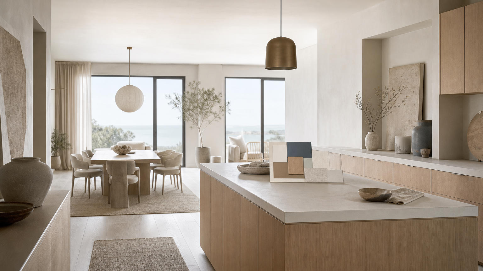
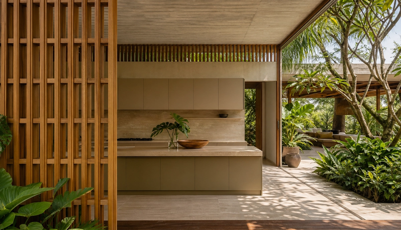
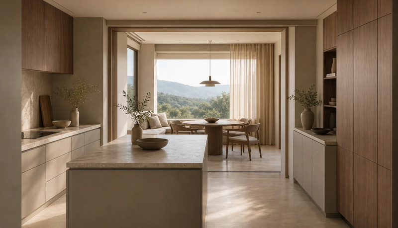
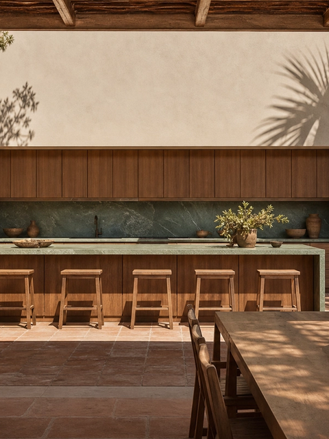
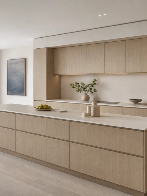
Warm and cool tones do different jobs in a residential kitchen. Champagne and bronze can soften the perceived temperature of a hard surface, especially when they sit near oak, plaster, or linen. Blue can calm the same palette when the home has coastal light, city glass, or a cool stone counter. If these tones are chosen separately, the kitchen can become fragmented: one finish feels decorative, another feels appliance-like, and the room loses the quiet rhythm that high-end interiors need. When the three tones are planned together, they can create hierarchy. Champagne may work for a breakfast wall, bronze may suit a secondary pantry plane, and a slate-blue note may belong only on a sample board, open shelf back, or neighboring material reference. The strongest palette is restrained. It lets 1 or 2 chromatic moments carry the room while neutral cabinetry, stone, and wood handle most of the visual volume.
| Palette decision | Approval question | Best residential use |
|---|---|---|
| Champagne-warm tone | Does the sample stay soft under morning and evening light? | Breakfast nook wall, island face, or hospitality zone. |
| Bronze depth | Does the tone add depth without looking ornamental? | Pantry threshold, dining-side panels, or a secondary storage plane. |
| Slate-blue cooling note | Does the color balance warm wood and pale stone? | Small accent plane, adjacent sample board, or reflected-light zone. |
| Neutral support surfaces | Do surrounding surfaces let the chromatic finish breathe? | Main cabinetry, tall storage, and long visual runs. |
How does the palette stay honest to the cabinet system?
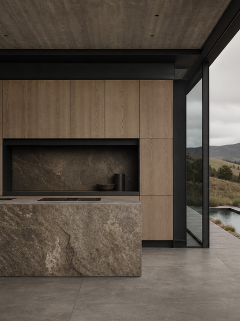
The palette should not blur the cabinet material claim. Fadior’s own proof remains specific: the company positions its cabinet bodies around 304 stainless steel, glue-free manufacturing logic, waterproof whole-home use, and a factory system built for repeatable production. The chromatic palette is not a new base material claim. It is a finish-planning layer that helps the room feel more residential while the cabinet story remains simple enough for a designer, homeowner, or developer to repeat. This matters because public sources often discuss broad architectural stainless applications, and some architectural cases use grades or environments outside Fadior’s residential kitchen promise. The responsible language is narrower: Fadior kitchens use 304 stainless steel as the base claim, and colored surface thinking can inform the palette, sample review, and lighting plan. The specification should never imply that a warmer tone automatically changes durability, corrosion resistance, or warranty terms unless the supplier documentation says so.
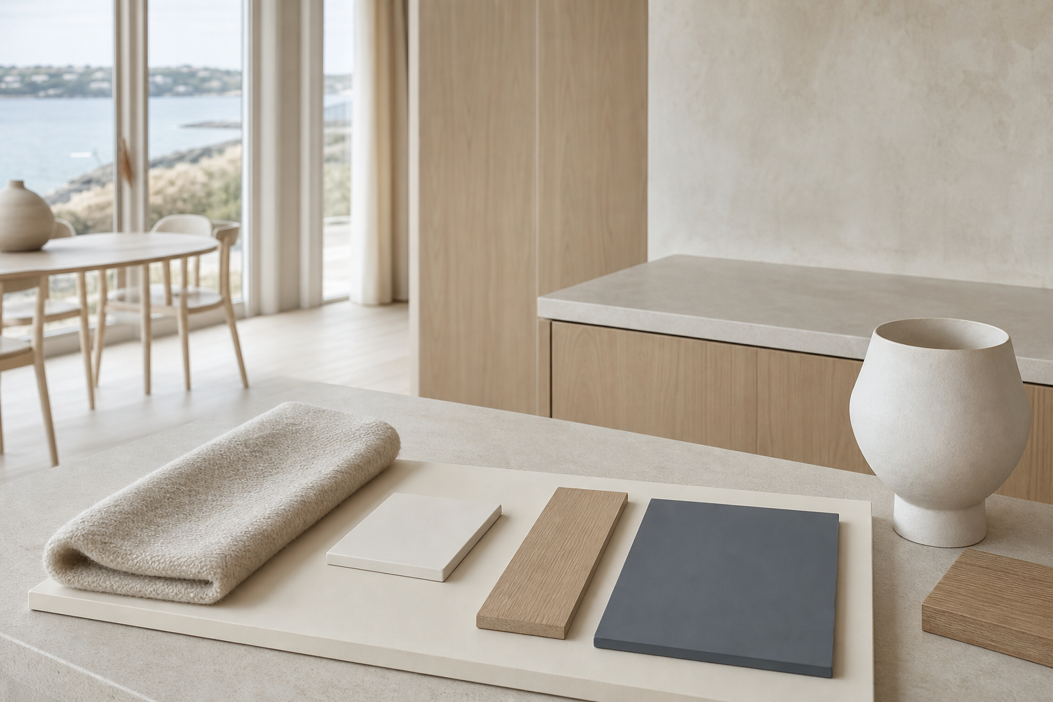
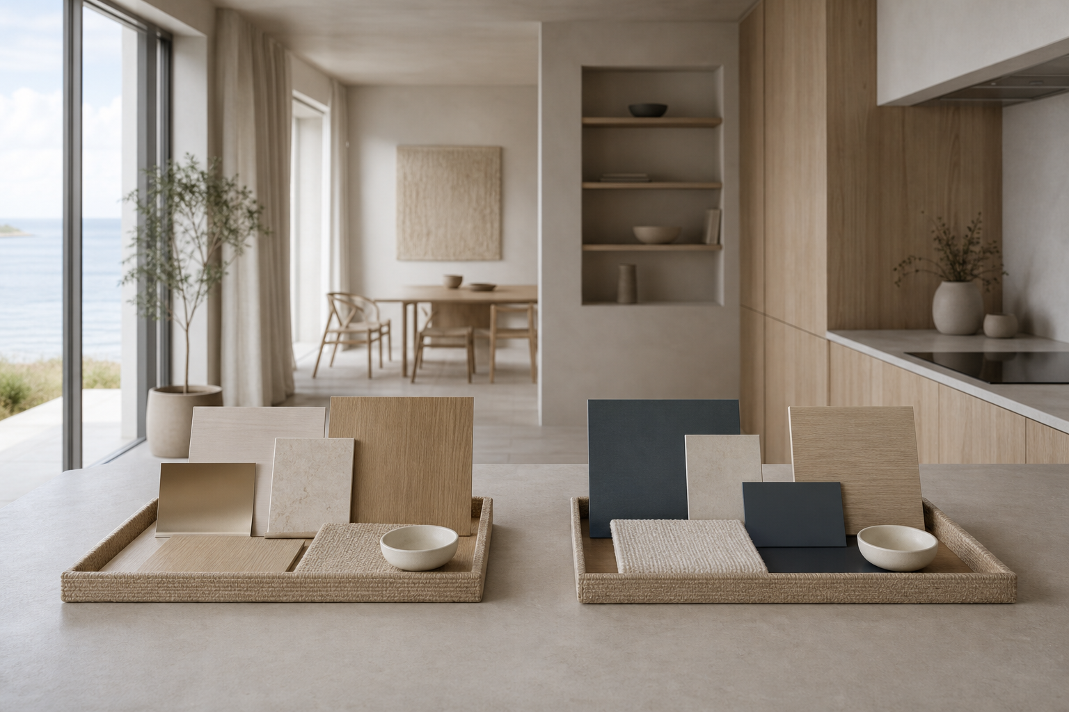
- Palette approval board
- A palette approval board is a physical set of large finish samples reviewed under the project’s real or simulated light before a homeowner signs off on final kitchen surfaces.
Which evidence should be on the approval board?
A proper approval board has more than attractive swatches. It should include a written description of the color process, at least one large sample, adjacent wood or stone references, cleaning notes, and a room placement map. The INOX-SPECTRAL information sheet and worldstainless special-finishes guidance both support a broader point: special finishes need project-specific handling rather than generic naming. For a home, the practical test is not laboratory language alone. The owner needs to see how the sample reads against the counter, floor, fabric, and window direction. The designer should test it at standing height, at seated dining height, and across the long view from the living area. A small chip may look controlled; a large vertical plane can feel stronger. If the hue shifts under a pendant or against a cool wall, the board should catch that before fabrication. This is also the moment to connect the visual decision to Fadior materials and finish standards so the client understands what is aesthetic, what is structural, and what must be maintained. The board should travel with the project file through design approval, ordering, installation review, and final handover. That continuity prevents a common failure: the designer approves one color relationship, the procurement team orders from a shorter description, and the installed room reads colder or heavier than expected. In high-value homes, the approval board is a control document as much as a design tool.
Approval board checklist
- Record 1 process note naming the surface path and the supplier’s cleaning guidance.
- Review at least 3 viewing conditions: morning daylight, task lighting, and evening ambient light.
- Place samples beside 4 adjacent surfaces: counter, floor, wall, and dining furniture.
- Approve 2 room distances: hand distance and whole-room distance from the entry view.
- Assign every chromatic tone to 1 room zone before fabrication begins.
When does a chromatic palette create specification risk?
The risk appears when color vocabulary outruns documentation. Words such as champagne, bronze, and blue are useful for design discussion, but they are not enough for a purchase decision. A supplier may use electrochemical coloring, PVD, powder coating, paint, or another process, and each route has different cleaning and repair assumptions. The risk also increases when the palette is spread too widely. A full kitchen in a strong tone can look impressive in a single render, but homes are lived in at breakfast, after work, under dim light, and during cleaning. High-touch zones need caution. Cooking splashes, water, and fingerprints make the approval standard higher around the sink, cooktop, and island edge. The more demanding the zone, the more conservative the palette should become unless supplier guidance supports the choice. This is why a custom kitchen consultation route should ask for room-zone mapping before a client signs off on the final finish.
How should Fadior use color without losing restraint?
Fadior’s strongest position is not maximum color. It is disciplined warmth. The brand already has a clear contrast against board-based cabinetry: waterproof 304 stainless steel, zero-formaldehyde construction logic, large-scale manufacturing, and a whole-home system that extends beyond the kitchen. A chromatic palette should amplify that story instead of distracting from it. The safest approach is to use color as a room-level design signal. A champagne note can soften a breakfast zone. A bronze accent can add depth near dining storage. A blue-grey companion can steady a pale coastal villa. The main kitchen mass can stay quiet, with the cabinet architecture, proportions, and manufacturing quality carrying the luxury signal. That restraint also helps sales conversations. The client can see a warmer home, while the specifier can still point to 304 stainless steel kitchen collections and whole-home kitchen and storage products without explaining away a decorative surface decision.
| Kitchen zone | Palette role | Specification caution |
|---|---|---|
| Breakfast wall | Warm champagne or soft neutral support. | Check morning glare and dining furniture adjacency. |
| Island face | Restrained chromatic moment visible from living area. | Review fingerprint and cleaning guidance. |
| Pantry threshold | Bronze depth or darker supporting tone. | Keep the long view balanced. |
| Sink and cooktop run | Neutral support surface. | High-touch zone needs conservative approval. |
What should architects ask before final sign-off?
Architects should ask 8 practical questions. What is the documented color process? Which sample size represents production? Which light condition was used for approval? Which room zone carries the tone? Which cleaning product is allowed? Which nearby surface changes the hue? Which client-facing note explains the base cabinet material? Which internal proof page supports the claim after handover? These questions turn a beautiful palette into a controlled specification. They also connect design to trust. Fadior smart factory manufacturing proof, quality standards and material controls, and finished residential project references give the owner a path beyond the visual board. If the answers are incomplete, the palette should be simplified, not forced. A quiet neutral room with 1 documented chromatic moment is stronger than a dramatic scheme built on uncertain finish language.
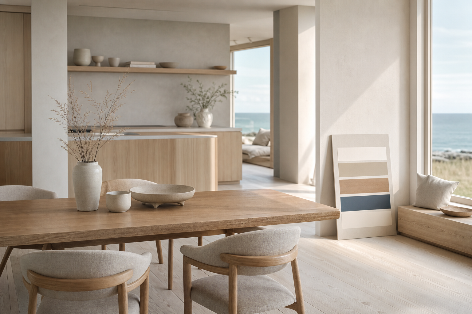
Does this palette fit GCC and coastal luxury homes?
The editor brief connects the palette to GCC demand for modular kitchen design and cool metallic finishes, but the best application is still selective. GCC villas, coastal apartments, and waterfront homes often have strong light, stone floors, large glazing, and indoor-outdoor views. Those conditions can make a warm finish feel elegant when the tone is controlled, or excessive when it is spread across every surface. A coastal villa chromatic palette board should therefore show the finish beside pale stone, oak, plaster, fabric, and the owner’s likely daylight. The same board should also show what remains neutral. That balance matters for resale, maintenance, and long-term living. Fadior can use the palette to answer the common objection that stainless steel feels cold, while still avoiding unsupported promises. The design message is simple: a kitchen can feel warmer without giving up a documented 304 stainless steel cabinet system. The same discipline helps later maintenance. A homeowner can clean, repair, or extend the room more confidently when the project record explains which surfaces are aesthetic accents, which surfaces are neutral support, and which surfaces carry the main cabinet performance claim. That record is small, but it keeps the palette understandable years after the first installation. It also gives sales teams clearer aftercare language.
How should the approval note be written for the client?
The client note should be short enough to repeat, but specific enough to prevent later misunderstanding. A strong note names the selected tone family, states where it will appear, and separates visual mood from cabinet material. For example, the designer can say that the kitchen uses a soft champagne-to-slate palette on selected visible planes, reviewed beside oak, pale stone, plaster, and textile samples, while the cabinetry baseline remains Fadior 304 stainless steel. That sentence does three jobs. It reassures the homeowner that the palette has a residential purpose, it gives the contractor a location-based instruction, and it keeps the material claim from drifting into vague luxury language. The note should also list the cleaning rule in plain words. If the supplier allows only certain cleaners, that belongs beside the signed sample, not in a separate handover file that no one reads. Finally, the note should include a fallback choice. If the large sample looks too strong after site lighting is installed, the team should already know whether to reduce the chromatic plane, move the tone to a secondary wall, or return to a calmer neutral surface. This avoids last-minute improvisation and protects the project budget.
Visible FAQ for chromatic palette approval
These questions should be answered before the client approves the palette. What is a chromatic stainless kitchen palette? It is a coordinated plan for colored stainless surfaces and nearby materials. Is it the same as paint? Not always; confirm the process in writing. Can Fadior stay 304-only? Yes, keep the cabinet baseline clear. Where should stronger tones go? Use them on selective room zones. What must be signed before fabrication? The process note, large sample board, light review, zone map, and cleaning guidance.
Related reading
Continue exploring the journal.
More guides, whitepapers, and insights from the Fadior journal.
Buyer's Guide
Colored Stainless Steel Kitchens Feel Warmer
Colored stainless steel kitchen design is moving from appliance shorthand into architectural specification. The real question is how warm finishes can support luxury interiors while Fadior keeps the cabinet system 304-only, waterproof, and zero-formaldehyde.
Technical Whitepaper
Electrochemical Stainless Finishes for Kitchens
A specification guide for designers comparing electrochemical color, coatings, and paint while keeping Fadior kitchen cabinetry anchored to 304 stainless steel.
References
Authoritative sources cited in this article
- Uginox spectral finish page
Manufacturer page describing spectral colored surfaces and an electrochemical color principle.
Uginox Spectral-Colore
- BSSA coloured stainless guidance
Industry guidance on colored stainless finish specification and applications.
British Stainless Steel Association
- worldstainless special finishes
Industry PDF covering special finishes and architectural surface language.
- INOX-SPECTRAL general information
Supplier technical notes for INOX-SPECTRAL surface behavior and processing considerations.
- Outokumpu Doppler case
Architectural case showing colored stainless surfaces at building scale and daylight response.
Outokumpu Doppler Building case
- ASTM A240 sheet standard
Standard reference page for chromium and chromium-nickel stainless plate, sheet, and strip.
ASTM A240
Editorial transparency
Sienna Park is a composite editorial persona maintained by Fadior Home's editorial team. Articles attributed to this byline are produced through an AI-assisted editorial workflow with human review, and represent the consolidated voice of multiple researchers and contributors.
Ready to specify?