
Light-Reactive Finish Schedule
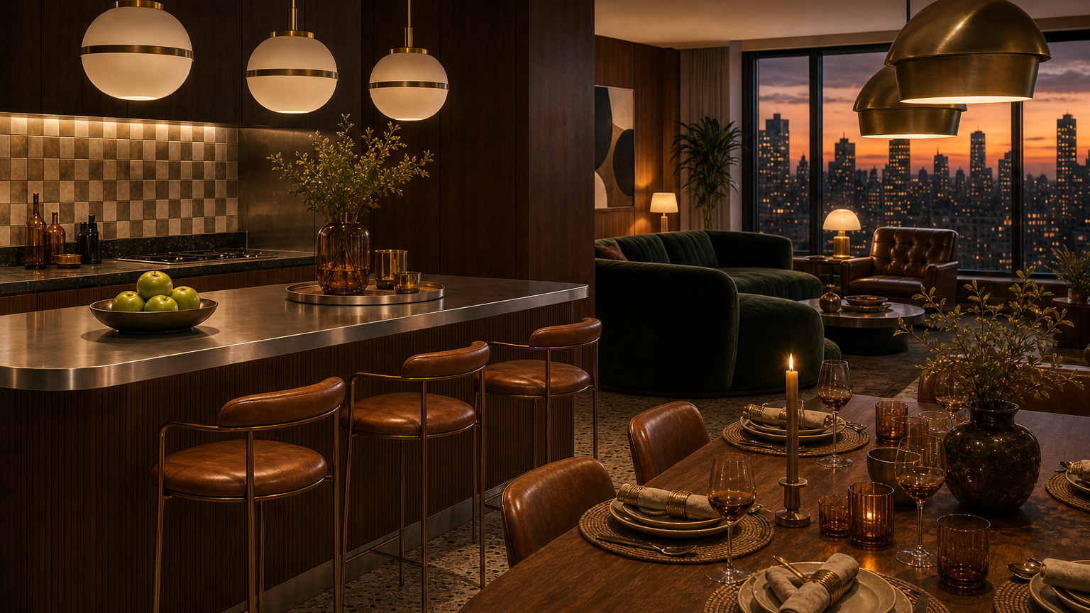
Colored stainless steel can add depth to a luxury kitchen, but only when sample, light, direction, batch, and care limits are written before production.
Direct answer
The Direct Answer
A light-reactive stainless finish schedule is a written approval plan for colored stainless steel surfaces that may change by light, angle, batch, and installation direction. It should keep Fadior cabinet claims anchored to 304 stainless steel, then document where color is allowed, which sample controls the decision, how daylight and evening light affect appearance, and what maintenance limits the buyer accepts before production begins.
- Light-reactive stainless finish schedule
- A light-reactive stainless finish schedule is a room-by-room approval record for colored stainless surfaces under real light and use.
Why does colored stainless need a schedule?
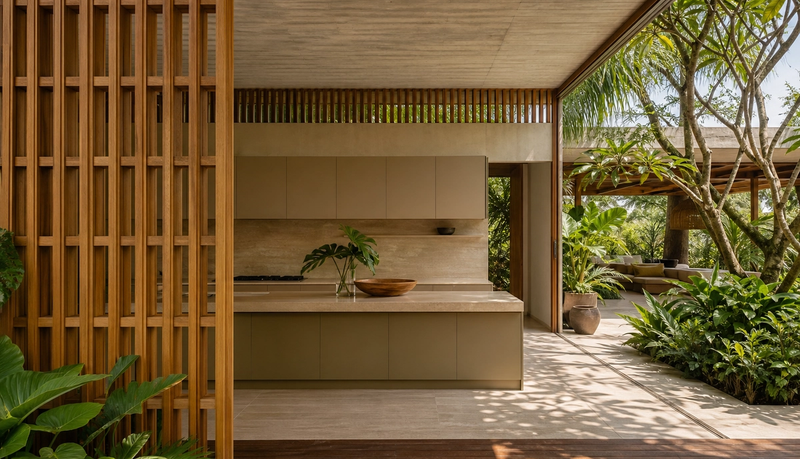
Colored stainless steel is not just a color choice. INOX-COLOR describes color created through an electrochemical process that develops the passive chromium oxide layer, while Outokumpu and Uginox show architectural surfaces whose appearance changes with light and viewing angle. That is useful for luxury kitchens, but it also makes approval more demanding than choosing a paint swatch. A schedule turns the idea into a decision record: sample, batch, direction, light scene, cleaning limit, and room role all have to be named before the surface is approved.
This is the right way to honor today's editor brief without repeating the recent colored-finish articles. The brief points toward colored stainless steel as material truth, not a color-of-the-year fad. The narrower buyer question is more practical: when a surface is light-reactive, how should the owner, designer, and maker agree on what will actually be installed? Fadior can answer that by separating the decorative finish conversation from the 304 stainless steel cabinet baseline.
How should samples be reviewed before approval?
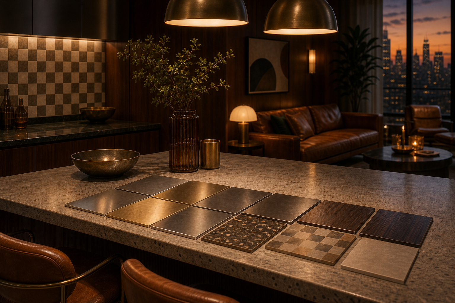
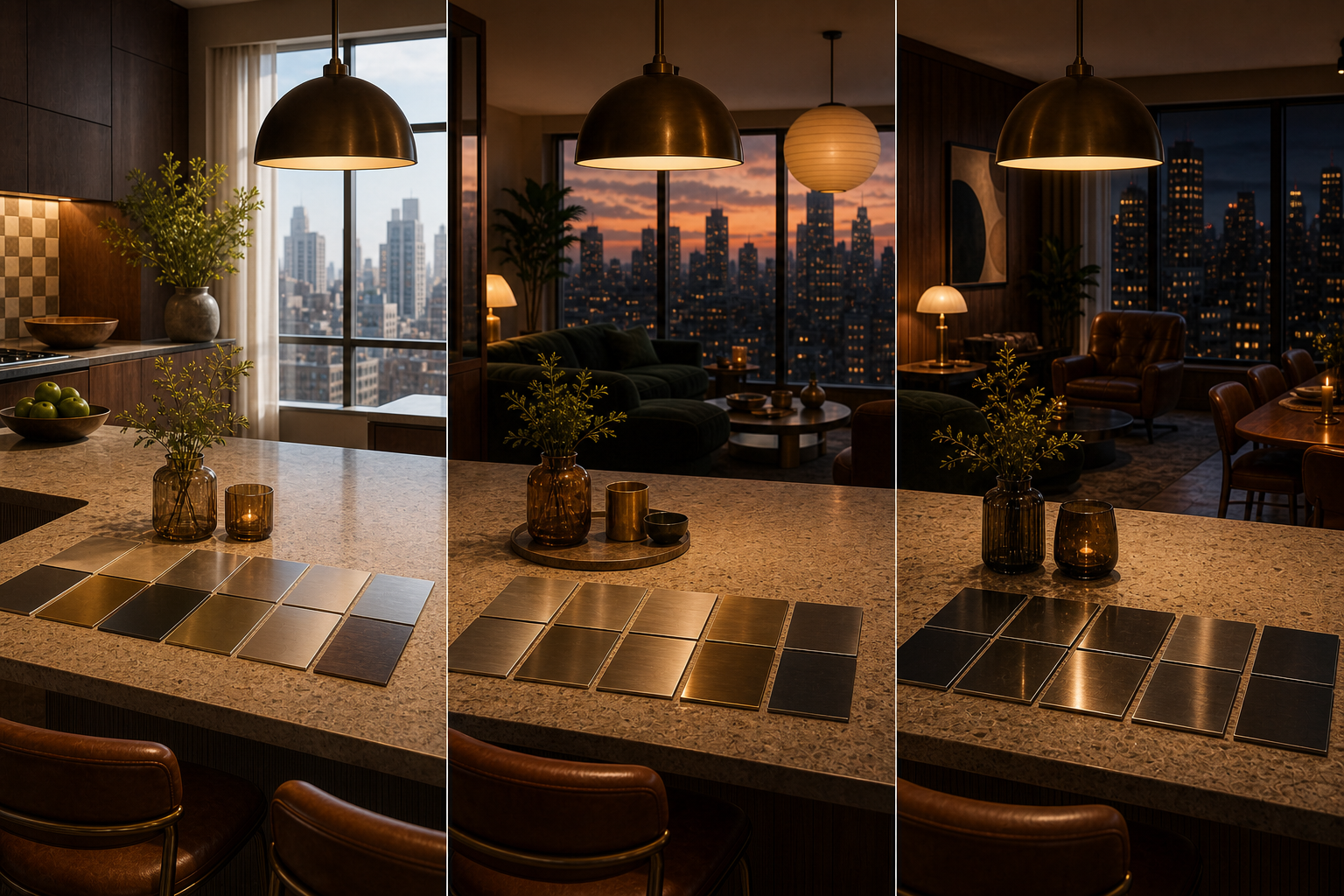
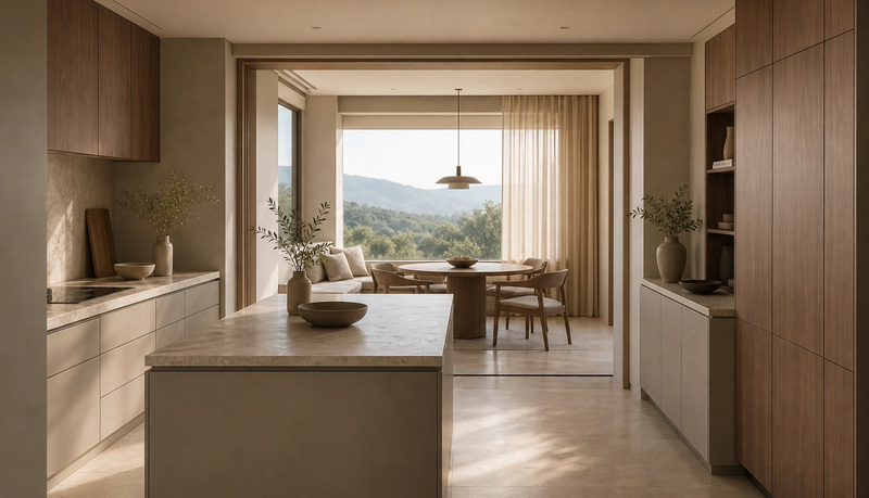
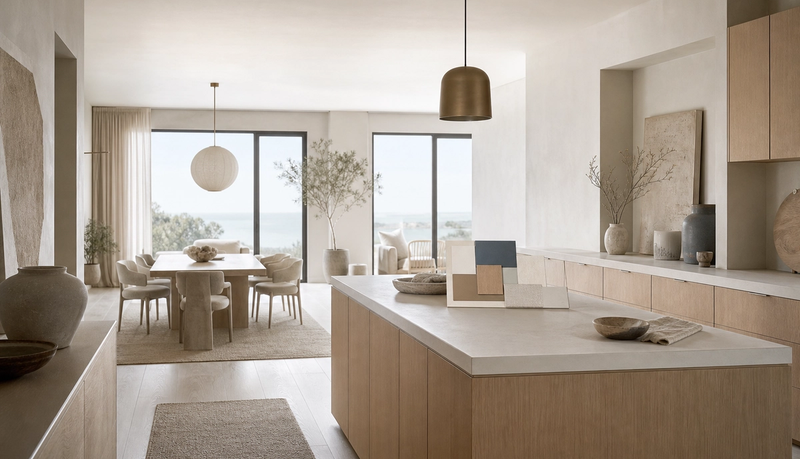
A useful sample review has at least 4 conditions. First, see the finish in hard daylight, because a warm tone can flatten beside a large window. Second, see it under evening hospitality light, because a surface that feels quiet at noon can become too dramatic at dinner. Third, rotate the sample, because brushed direction and viewing angle can change the perceived color. Fourth, compare it with stone, flooring, upholstery, and the planned appliance zone, not on a blank desk.
The INOX-SPECTRAL guidance matters because it treats colored stainless as a controlled surface process with ordering and care implications. A design team should therefore record the chosen sample, the viewing direction, and the approved location. That does not make every colored surface risky. It simply means the approval standard has to match the material behavior. The Fadior material library and product planning pages should become part of that decision path rather than an afterthought.
| Decision point | What to record | Buyer risk | Fadior response |
|---|---|---|---|
| Control sample | Approved sample code, finish direction, and room location | A later panel does not match the mood-board memory | Use one documented sample as the reference for production discussion |
| Light scene | Daylight, shaded afternoon light, and warm evening light | Color shifts after installation and feels unexpected | Review samples in the actual room or a close lighting simulation |
| Batch expectation | Whether adjacent planes must come from the same order batch | Small tone differences appear across large surfaces | Limit light-reactive finish to surfaces where variation is acceptable |
| Cleaning boundary | Allowed cleaning routine and scratch visibility tolerance | The buyer expects a decorative surface to behave like a hidden utility panel | Separate daily-use work zones from selected visual accent zones |
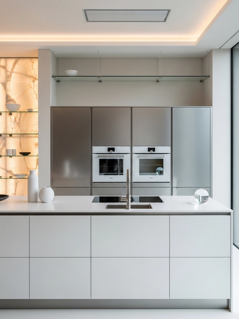
| Performance baseline | Which cabinet bodies stay 304 stainless steel | A finish trend becomes an unsupported durability claim | Keep structural and hygiene claims tied to Fadior 304 stainless steel |
Which claims are safe, and which should be avoided?
Safe claims are specific. It is fair to say that some colored stainless processes, including INOX-SPECTRAL, use electrochemical treatment of the chromium oxide layer rather than ordinary paint. It is fair to say that colored architectural stainless can look different under changing daylight and viewing angles. It is fair to say ASTM A240 covers chromium and chromium-nickel stainless steel sheet, plate, and strip categories that matter when a buyer asks what the base material is.
Unsafe claims are broader than the evidence. Do not say all colored stainless is coating-free. Do not promise exact color matching across light, angle, batch, and installation direction. Do not imply scratches are easy to repair. Do not say color alone improves corrosion behavior in every environment. And for Fadior, do not drift away from the 304 stainless steel cabinet baseline. The schedule exists to keep those boundaries clear while still allowing a richer luxury palette.
- Chromium oxide layer
- The chromium oxide layer is the passive protective surface film that forms on stainless steel and can be modified by some coloring processes.
What does the brief from Arclinea add?
The Arclinea reference in the editor brief is useful for design culture, not for material proof. Salone del Mobile describes Arclinea as a kitchen brand with almost a century of history and a long relationship with Antonio Citterio. That points to a larger luxury-kitchen lesson: premium kitchens are judged by proportion, room continuity, and the way technical objects disappear into architecture. Colored stainless should be evaluated in the same spirit.
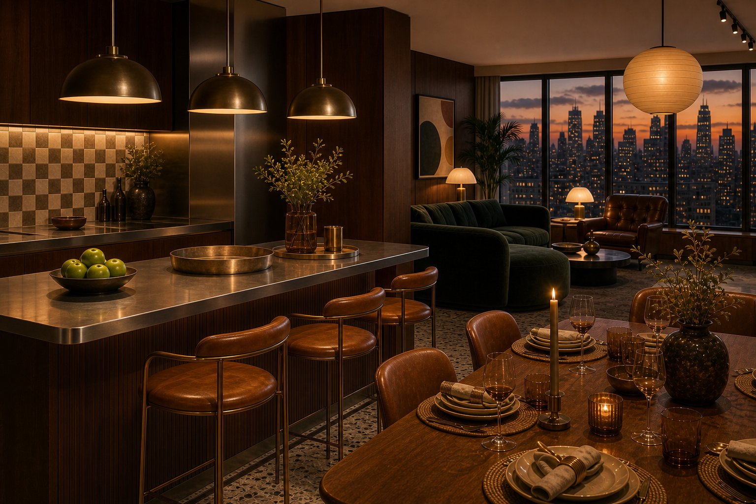
A light-reactive finish schedule is not a factory form. It is the design discipline that keeps a high-end kitchen from becoming a showroom experiment. If a champagne, bronze, blue, or smoked tone is used, it should strengthen the kitchen's room composition. If it competes with the living area, dining scene, or stone selection, the schedule should move that color to a smaller plane or replace it with a quieter Fadior finish.
Where does Fadior proof belong in the schedule?
Fadior proof belongs in the middle of the finish decision. The company intelligence file records 304 stainless steel as the core cabinet material, 80+ powder-coat colors, PVD decorative tones, 3D wood-grain transfer, linen-embossed texture, cloud-texture anti-pollution treatment, and glue-free construction logic. It also records 213 cumulative patents, a 600M RMB smart-factory investment, exports to 50+ countries and regions, and a 30-year durability story for cabinet bodies.
Those facts give the schedule a commercial reason to exist. The buyer can ask for a warm, light-reactive palette without turning every visual wish into a performance claim. The cabinet baseline remains 304 stainless steel. The visible finish strategy can then be chosen from Fadior material options, PVD categories, powder-coat contrasts, or carefully specified colored-surface references. The result is easier for sales, design, production, and after-service teams to defend.
Seven checks before approving a light-reactive finish schedule
- Confirm the 3 main light scenes: hard daylight, shaded afternoon light, and warm evening hospitality light.
- Record the 1 control sample that governs color, finish direction, and approved room location.
- Separate the 304 stainless steel cabinet baseline from the decorative color surface decision.
- Decide which surfaces can accept normal tone variation and which require tighter batch control.
- Map daily-use wet zones, island faces, dining edges, and display planes as different approval zones.
- Write the cleaning routine, scratch visibility tolerance, and replacement expectation before production.
- Connect the schedule to Fadior material pages, product pages, and consultation notes before final signoff.
How should the finished schedule be written?
The finished schedule should read like a decision record. Each surface needs a role, a finish reference, a light condition, a viewing direction, a cleaning expectation, and a reason. A large cabinet wall may stay quiet because it controls the room. A dining-edge accent may carry a warmer tone because it is seen mostly under evening light. A wet work wall may stay practical because it is cleaned often. A display plane may carry the strongest visual effect because it earns attention without taking daily abuse.
This written structure also protects future changes. If the owner adds a pantry run, replaces a panel, or expands the kitchen into a connected lounge, the team can see why the original choice was made. That matters for premium homes because luxury is not only the first impression. It is the ability to preserve the room's logic after years of use, new appliances, and changing family routines. It should name the owner approval date, too.
How does this avoid repeating recent finish articles?
The recent Journal sequence already covered colored stainless steel, electrochemical finish checks, chromatic palette planning, oxide approval, intrinsic color finishes, Dubai surface specification, and Gulf atmosphere planning. The new schedule angle should not reopen those same questions. Its job is narrower: it turns the color discussion into a production signoff tool. That makes the keyword different, the buyer problem different, and the sales use different.
A designer can use the schedule before asking Fadior for a quote. A homeowner can use it to explain what worries them about color shift, replacement panels, or daily cleaning. A dealer can use it to show why a premium cabinet decision is not only about a beautiful rendering. The schedule becomes the bridge between inspiration and order readiness. It also keeps the Fadior conversation honest: color may carry atmosphere, but 304 stainless steel remains the cabinet baseline for waterproof, formaldehyde-free, long-life performance.
This distinction matters in Middle East and high-rise projects, where kitchens often sit beside living, dining, staff, and hospitality zones. A finish that feels perfect in a showroom can behave differently beside full-height glazing, shaded balconies, evening pendants, and reflective stone. The schedule asks those questions before manufacturing, not after installation. That is the practical editorial value of the narrowed topic. It gives the reader one concrete action: write the approval schedule before choosing the final surface package. That action is easy for an architect to reuse, easy for a homeowner to understand, and easy for a sales team to connect back to samples, drawings, consultation notes, and material proof.
Which questions should buyers ask before signoff?
Is colored stainless steel always coating-free? No. Some verified processes use electrochemical coloring, but the buyer should ask which process is being specified and what care guidance applies.
Can a light-reactive finish match exactly in every room? No. Light, angle, batch, and direction can change perception, so the control sample and approved viewing condition must be written down.
Should the whole kitchen use the same strong color? Usually no. Large planes, wet zones, dining edges, and display walls have different visual and maintenance jobs.
Why keep 304 stainless steel in the discussion? Because Fadior's cabinet performance claim should remain anchored to 304 stainless steel, while the visible palette can be tuned separately.
What should a buyer send before consultation? Send the floor plan, daylight direction, preferred warmth level, cleaning expectations, and the 3 finish references that best express the desired mood.
Related reading
Continue exploring the journal.
More guides, whitepapers, and insights from the Fadior journal.
Buyer's Guide
Colored Stainless Steel Kitchens Feel Warmer
Colored stainless steel kitchen design is moving from appliance shorthand into architectural specification. The real question is how warm finishes can support luxury interiors while Fadior keeps the cabinet system 304-only, waterproof, and zero-formaldehyde.
Technical Whitepaper
Electrochemical Stainless Finishes for Kitchens
A specification guide for designers comparing electrochemical color, coatings, and paint while keeping Fadior kitchen cabinetry anchored to 304 stainless steel.
Technical Whitepaper
Chromatic Stainless Kitchen Palette
A palette-planning guide for designers using champagne, bronze, and blue tones while keeping Fadior kitchen cabinetry anchored to 304 stainless steel.
Related products
Specific products worth reviewing next.
References
Authoritative sources cited in this article
- INOX-COLOR variety in colour
Explains the color range and light-reactive appearance of colored stainless surfaces.
- INOX-SPECTRAL process overview
Describes electrochemical coloring through the passive chromium oxide layer.
INOX-COLOR INOX-SPECTRAL process
- INOX-SPECTRAL general information
Technical guidance for sample approval, ordering, cleaning, and surface behavior.
INOX-SPECTRAL general information PDF
- Outokumpu Doppler colored surface case
Built-project evidence for colored stainless surfaces changing with light and viewing angle.
Outokumpu Amazon Doppler case study
- Uginox Spectral-Colore product page
Architectural reference for colored stainless surface specification and appearance.
Uginox Spectral-Colore
- ASTM A240 stainless sheet specification
Standards reference for chromium and chromium-nickel stainless steel plate, sheet, and strip.
ASTM A240/A240M
- Salone del Mobile Arclinea story
Context for Arclinea, Antonio Citterio, and the luxury kitchen design lineage mentioned in the brief.
Editorial transparency
Yuki Tanaka is a composite editorial persona maintained by Fadior Home's editorial team. Articles attributed to this byline are produced through an AI-assisted editorial workflow with human review, and represent the consolidated voice of multiple researchers and contributors.
Ready to specify?