
Chromatic Specification Record
A chromatic kitchen specification record gives architects and luxury homeowners a practical way to approve expressive color before production: sample, light, room, care, and 304 cabinet proof in one place.
Direct answer
The Direct Answer
A chromatic kitchen specification record is the written proof that a colored surface has been approved by sample, room, light, care limit, and production boundary before a luxury kitchen is ordered. It lets a designer use expressive bronze, champagne, blue, or dark tones without turning color into a vague mood-board promise. For Fadior, the record keeps cabinet durability claims tied to 304 stainless steel while treating decorative color as a controlled visual decision.
- Chromatic kitchen specification record
- A chromatic kitchen specification record is a written signoff for color, sample, light, care, and production boundaries.
What should a chromatic kitchen specification record prove?
The record should prove that the approved color is not a guess. It names the exact sample reviewed, the room where the sample was judged, the lighting scenes used for approval, the surfaces allowed to carry the color, and the cleaning limits accepted by the owner. INOX-COLOR describes the INOX-SPECTRAL process as suitable for sheets up to 2000 x 6000 mm and 0.5 to 4.0 mm thick, which matters because large decorative planes can behave differently from a small swatch. Uginox explains that spectral-colored finishes vary by angle, light, and direction of installation. Those 3 variables belong in the record before cabinet drawings are frozen. In a Fadior kitchen, the written record also separates the expressive surface decision from the structural promise: the cabinet system remains anchored to 304 stainless steel, glue-free construction, waterproof use, and long-term serviceability. The record should also identify the decision owner. In a family project, one person may care most about hospitality atmosphere while another cares about cleaning and replacement. Recording the owner of each decision prevents late-stage drift. A good signoff sheet also includes a small rejection list: finishes reviewed and deliberately not selected, with 1 sentence explaining why each was excluded. That gives the project team a memory of the decision, not just the final choice.
Why is color signoff different from ordinary finish selection?
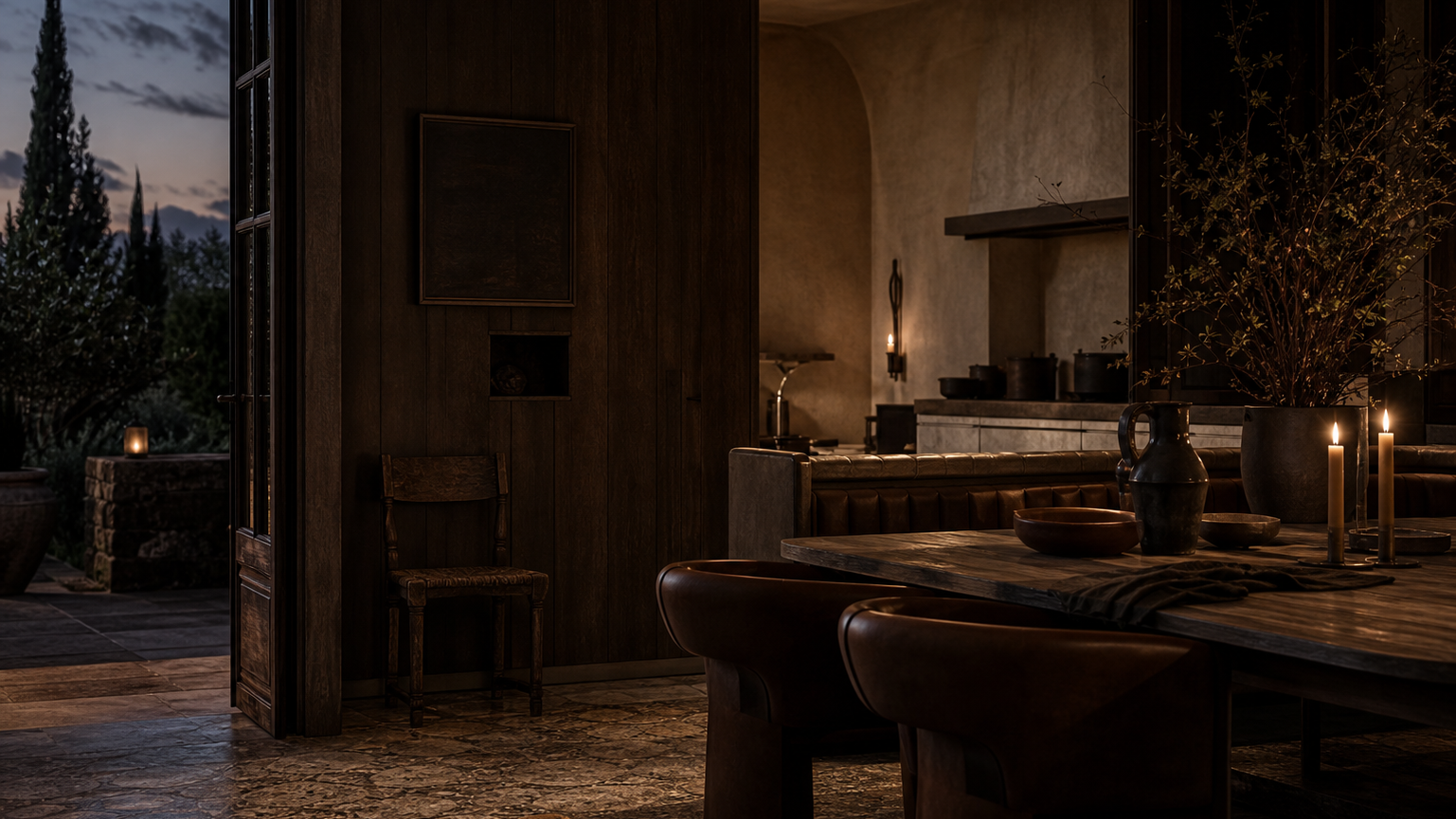
Ordinary finish selection often works by memory: a homeowner sees a bronze, champagne, or muted blue surface, likes it, and expects the installed room to feel the same. Chromatic finishes need more discipline because light interference, viewing angle, and installation direction can shift the perceived tone. The same surface may feel warm at dinner, cooler beside a window, and deeper when placed vertically on a tall plane. A proper record turns that variability into an accepted design feature instead of an after-service argument. It states which color movement is desirable, which variation is acceptable, and which location needs a calmer finish. That distinction is especially important in GCC villas, where daylight can be hard, evening hospitality light can be warm, and open kitchen islands may be viewed from 4 directions in a single reception space.
| Decision | Record it as | Risk if missing | Fadior use |
|---|---|---|---|
| Control sample | 1 approved sample code, date, and room location | Later panels are judged against memory instead of proof | Tie the approved surface to the cabinet order file |
| Light scenes | 3 checks: daylight, shaded afternoon, and evening hospitality light | The room feels different after installation | Review the finish under the light that buyers will actually use |
| Viewing direction | A vertical, island, and dining-side view note | Color shifts across open-plan circulation | Assign expressive color only to planes that tolerate movement |
| Care boundary | 1 written cleaning and scratch-visibility expectation | A decorative surface is treated like a hidden utility panel | Separate display planes from daily wet work zones |
| Performance baseline | 304 cabinet body and fabrication claims listed separately | A color story becomes an unsupported durability claim | Keep Fadior structural proof distinct from decorative tone |
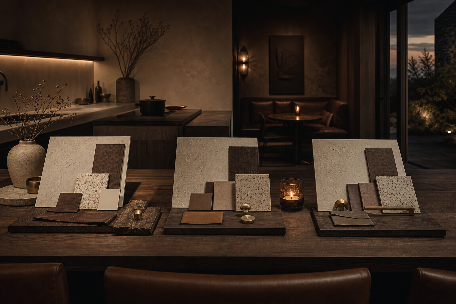
How should the sample be approved?
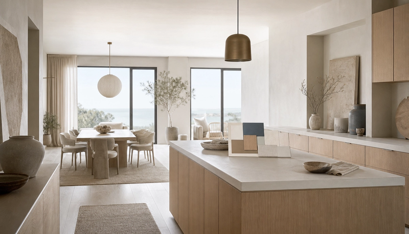
Approve the sample as a physical object, not as a photograph. The record should include the supplier or internal sample reference, sample size, finish direction, room location, approval date, and the person who signed it off. If the final kitchen uses multiple adjacent colored planes, the record should say whether those planes need batch alignment or whether normal variation is accepted. Atlas Steels shows why supply-chain detail belongs in design documents: specialty materials move through product forms, service centres, and technical literature, not just inspiration boards. For a premium homeowner, the practical question is simple: when a replacement panel, extension, or future room is ordered, what is everyone comparing against? The answer should be a written sample log with 1 governing sample, not a phone photo saved months earlier. The sample should be photographed only after the physical review is complete, and the photograph should never replace the sample. A useful approval photo includes the sample beside the adjacent counter, floor, wall, or dining finish so future teams know what the color was meant to harmonize with. If the kitchen includes a bar, breakfast zone, or visible pantry wall, the sample should be checked against each zone separately. One beautiful tray does not automatically approve every surface in the room.
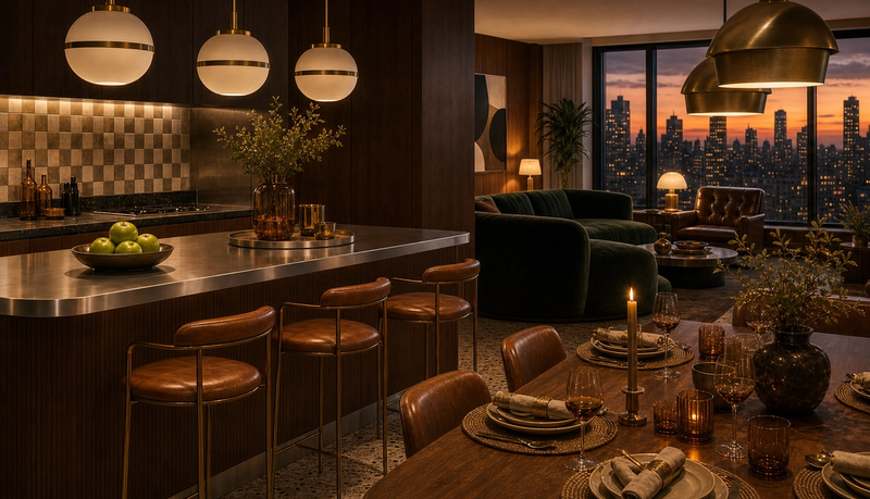
Which lighting checks belong in the record?
Use at least 3 lighting checks. First, inspect the sample in hard daylight near the actual room opening. Second, inspect it in shaded afternoon light, because many villas have deep overhangs, courtyards, or adjacent rooms that soften color. Third, inspect it under the warm evening scene used for dining and entertaining. The record should name the color temperature if known, the approximate viewing distance, and whether the color was judged on a horizontal, vertical, or island-facing plane. These notes prevent the common mismatch between showroom sparkle and residential calm. In Belgian, Milanese, Gulf, or Tokyo-inspired interiors, color is rarely the whole story; it works through mass, shadow, texture, and proportion. A lighting matrix preserves that design intent after production starts. The record should be strict about artificial light because warm lamps can make a muted surface feel richer than it will under task lighting. For open-plan homes, the sample should be seen from the living room, the dining table, and the main circulation path. If the family entertains after sunset, the evening scene deserves equal weight with daylight. A finish that wins only under showroom lighting is not ready for a kitchen that will be used every morning and every night.
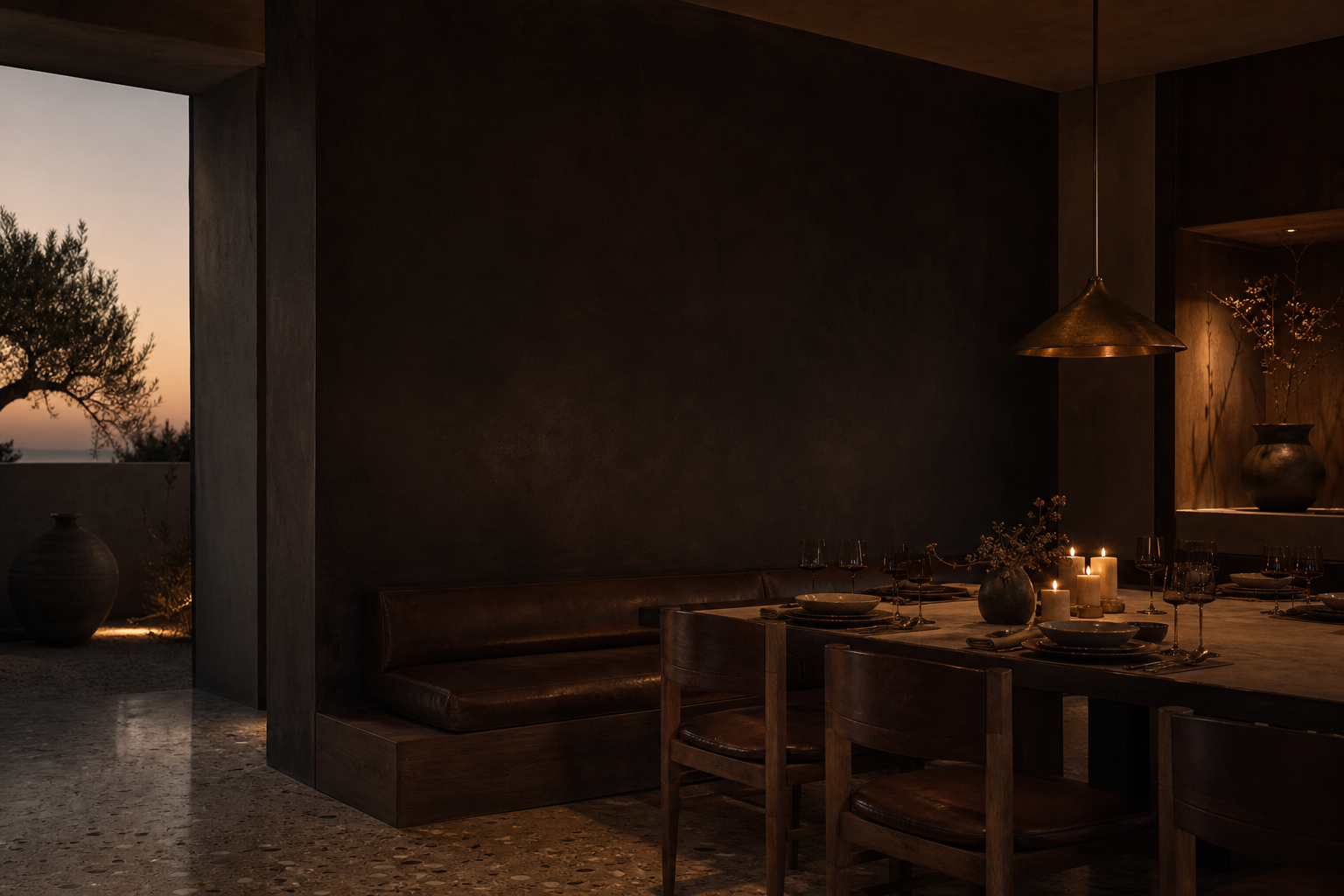
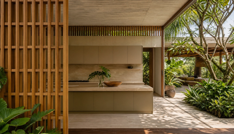
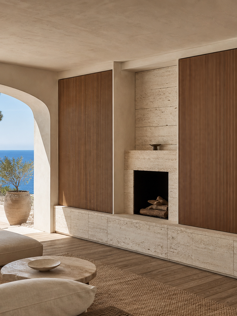
Where should chromatic color be limited in a kitchen?
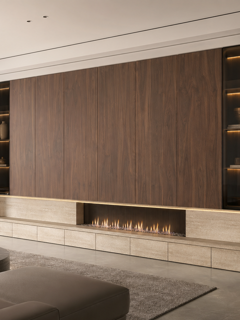
The safest rooms do not spread strong color everywhere. They use a chromatic finish where it supports hierarchy: a bar face, a dining-side panel, a tall display wall, a niche, or a secondary preparation zone. Daily wet zones, hard-working sink runs, and heavy cooking surfaces often need calmer, easier-to-service finishes. Fantini shows the power of color as identity: I Balocchi began in 1978 and introduced color into a world that had treated taps as minor technical objects. A kitchen can learn from that move without copying it literally. Color should make one plane memorable, not make every maintenance decision harder. Fadior's product planning should therefore mark each surface as display, daily work, storage, or transition before the chromatic finish is approved. The surface map should mark primary-touch and secondary-touch areas. Primary-touch areas include drawer fronts, sink runs, appliance-adjacent zones, and everyday island edges. Secondary-touch areas include display walls, dining-side panels, bar fronts, or upper niches. Expressive color usually carries less risk when it is placed in a secondary-touch role, because the owner experiences the atmosphere without asking the finish to absorb every spill, handprint, and cooking routine.
- Light-reactive color
- Light-reactive color is perceived color that changes with viewing angle, installation direction, and the light falling on the surface.
How does the record protect 304 performance claims?
The record should state that the expressive color decision is separate from the cabinet performance baseline. Fadior can claim 304 stainless steel cabinetry, waterproof use, glue-free construction, and formaldehyde-free material logic because those claims come from the cabinet system, not from an external mood reference. The company intelligence file supports the distinction: Fadior uses 304 stainless steel across kitchen cabinets, wardrobes, vanities, and related whole-home systems, with a 600 million RMB smart factory and 60,000+ sqm operational footprint supporting production scale. A chromatic record can reference those facts, but it should not imply that every external colored reference has the same kitchen-ready behavior. That is the difference between responsible specification and decorative borrowing. This separation is also useful for international specification. A homeowner in Dubai, Riyadh, Doha, Singapore, or Sydney may bring references from Italian kitchens, architectural cladding, yacht interiors, hospitality bars, or bath fittings. Those references can guide the mood, but the Fadior order still needs its own material, fabrication, warranty, and care record. The record makes room for inspiration while keeping the signed order responsible.
What should architects ask before final signoff?
Architects should ask 5 buyer-facing questions. Which sample governs the order? Which light scene matters most to the family? Which surfaces may vary without becoming a defect? Which cleaning routine is acceptable? Which future replacement or expansion decision will rely on the same record? These questions move the discussion away from abstract luxury and toward ownership. Arclinea's long kitchen history shows why that matters: Salone del Mobile records Arclinea's roots in 1925, the 1958 Thea kitchen, the 1963 Claudia kitchen, and Antonio Citterio's 1988 Italia project bringing professional catering standards into the home. Serious kitchens keep evolving because they convert design ideas into repeatable systems. Fadior should do the same with chromatic color: treat the surface as a planned system, not a passing accent.
Seven entries every chromatic record should include
- 1 governing sample reference, with approval date and room location.
- 3 lighting scenes: daylight, shaded afternoon, and evening hospitality light.
- 2 viewing orientations: one vertical plane and one island or dining-side plane.
- 1 written care routine covering fingerprints, cleaning frequency, and scratch visibility.
- A surface map separating display planes, wet work zones, storage fronts, and transition panels.
- A 304 stainless steel cabinet baseline that remains separate from decorative color claims.
- At least 1 future-service note explaining how replacements or additions will be matched.
When is a chromatic finish the wrong choice?
A chromatic finish is the wrong choice when the buyer expects every panel to look identical in every light, when cleaning tolerance is low, when the room has uncontrolled glare, or when the color is being used to hide weak planning. It is also wrong when the specification cannot separate source evidence from local responsibility. INOX-COLOR and Uginox provide useful process and behavior references, Fantini provides a design precedent for color changing the status of a technical object, Arclinea provides a kitchen-system precedent, and Atlas provides a supply-chain precedent. None of those sources should be treated as a substitute for Fadior's own sample approval. The record's job is to translate inspiration into accountable decisions inside one project.
How should the buyer use the record during consultation?
The buyer should bring the record into consultation as a decision sheet. On the commercial side, it should connect to the Fadior product range, the materials page, the manufacturing proof page, and the consultation route so the next conversation can move from mood to feasibility. On the trust side, it should document why 304 stainless steel remains the performance foundation even when the visible palette becomes warmer, darker, or more expressive. That combination gives sales, design, and after-service teams the same language. It also gives the owner a document that can be saved, forwarded, and reviewed months later when a second room, replacement surface, or expanded storage zone is discussed. The consultation version should be short enough for a client meeting and specific enough for production. A 2-page format is usually enough: page 1 for sample, light, surface map, and care; page 2 for links to materials, products, manufacturing proof, and the consultation notes. Long reports are rarely opened later. A concise record can travel with the quotation, design drawings, and final service file.
What common buyer questions should be visible?
What is a chromatic kitchen specification record? It is the shared approval record for the physical sample, room location, light scenes, care boundary, and production decision. Why does colored stainless need extra signoff? Perceived color can move with light, angle, and direction, so the owner should approve that behavior before order release. Does the record replace Fadior material proof? No; it controls the visual decision while 304 stainless steel remains the cabinet performance baseline. How many lighting scenes should be reviewed? Use at least 3: daylight, shaded afternoon light, and warm evening hospitality light. Where should expressive color be used first? Start with selected display, dining, or bar-facing planes before daily wet work zones.
Buyer questions to settle before order release?
Before release, the owner should be able to answer 5 plain questions. What sample did we approve? Where will the strongest color appear? How does it look in morning, afternoon, and evening light? What care routine have we accepted? What stays protected by the 304 stainless steel cabinet baseline? If those answers are unclear, the project is not ready for production. If they are written down, the chromatic finish becomes less risky and more architectural: an expressive surface chosen with the same seriousness as layout, storage, waterproofing, and long-term service.
Related reading
Continue exploring the journal.
More guides, whitepapers, and insights from the Fadior journal.
Buyer's Guide
Colored Stainless Steel Kitchens Feel Warmer
Colored stainless steel kitchen design is moving from appliance shorthand into architectural specification. The real question is how warm finishes can support luxury interiors while Fadior keeps the cabinet system 304-only, waterproof, and zero-formaldehyde.
Buyer's Guide
Light-Reactive Finish Schedule
Colored stainless steel can add depth to a luxury kitchen, but only when sample, light, direction, batch, and care limits are written before production.
Technical Whitepaper
Chromatic Stainless Kitchen Palette
A palette-planning guide for designers using champagne, bronze, and blue tones while keeping Fadior kitchen cabinetry anchored to 304 stainless steel.
References
Authoritative sources cited in this article
- INOX-SPECTRAL process overview
Process page for colored stainless surfaces, sheet sizes, and food-contact compliance note.
INOX-COLOR INOX-SPECTRAL process
- Uginox spectral color behavior
Explains spectral color variation by angle, light, and installation direction.
Uginox Spectral-Colore
- Fantini I Balocchi color precedent
Official product story for I Balocchi and color as design identity.
Fantini I Balocchi
- Arclinea kitchen history
Historical source for Arclinea kitchen evolution and Antonio Citterio references.
Arclinea history
- Atlas Steels supply network
Supplier and service-centre context for specialty material documentation.
Atlas Steels
Editorial transparency
Marco Rinaldi is a composite editorial persona maintained by Fadior Home's editorial team. Articles attributed to this byline are produced through an AI-assisted editorial workflow with human review, and represent the consolidated voice of multiple researchers and contributors.
Ready to specify?