
Oxide Color Kitchen Finish Approval
A specification guide to approving oxide-colored stainless surfaces through light tests, tolerance notes, cleaning rules, and 304 cabinet integration.
Direct answer
The Direct Answer
Oxide color kitchen finish approval is the sign-off process for a colored stainless steel surface whose hue comes from light interference in the chromium oxide layer, not from ordinary paint. For a luxury kitchen, the approval should test light direction, viewing angle, color range, cleaning routine, and fit with a 304 stainless steel cabinet system before any large surface package is released.
- Oxide color kitchen finish approval
- Oxide color kitchen finish approval is a sample and specification review for angle-dependent colored stainless steel surfaces.
Why oxide color is different from a normal finish choice
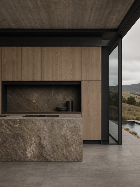
Colored stainless steel can look like a simple palette decision because the visible result is gold, champagne, bronze, blue, black, or another refined tone. The technical story is different. INOX-COLOR describes the INOX-SPECTRAL process as a computer-controlled electrochemical method that builds up a transparent chromium oxide layer; the color appears through light interference, not through a coat of lacquer or pigment. Uginox describes the same family of spectral finishes as lively surfaces that vary by angle, light, and installation direction. That means a kitchen team cannot approve the hue from a flat swatch alone. The final room, the opening direction, the island plane, the wall plane, and the evening lighting all change how the surface reads.
What should the architect approve first?
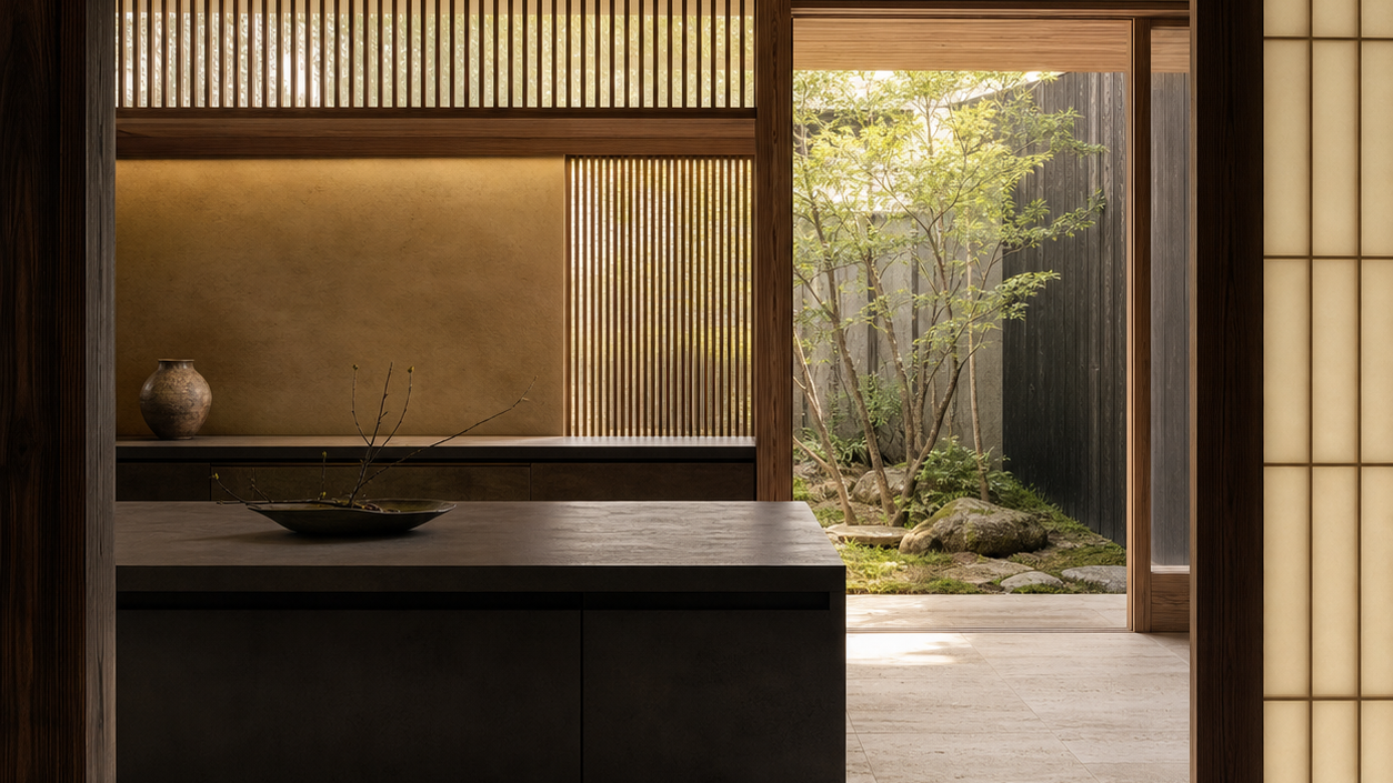
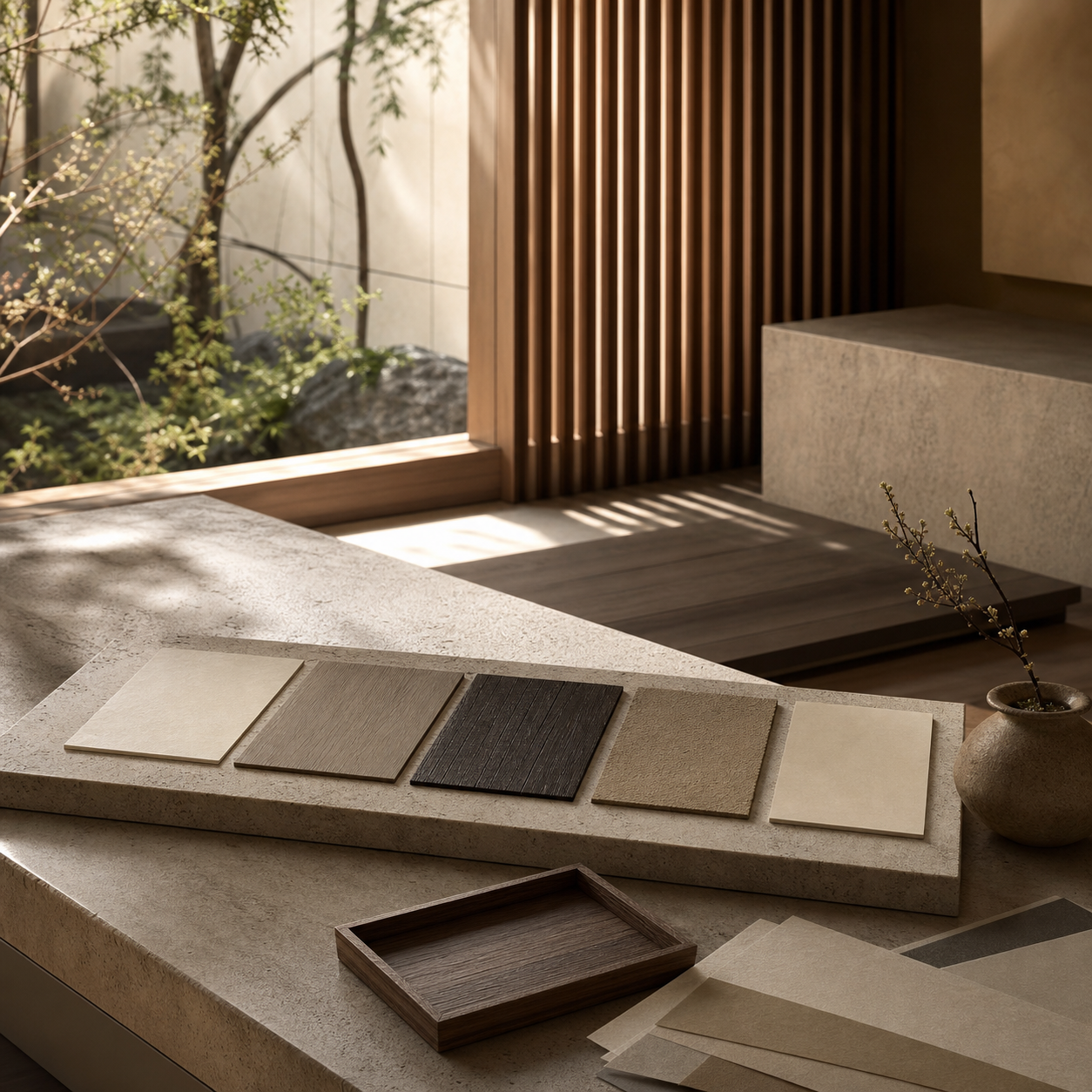
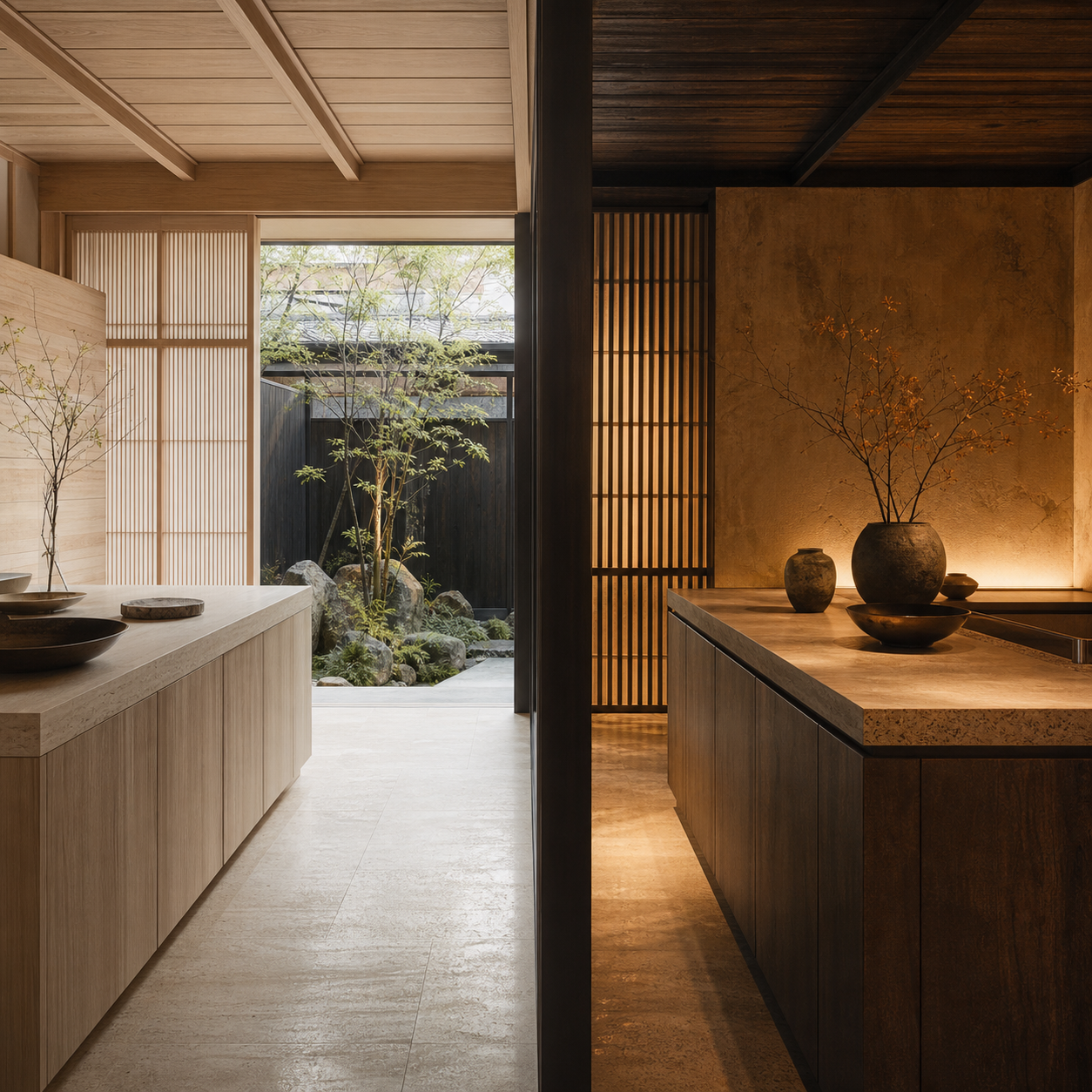
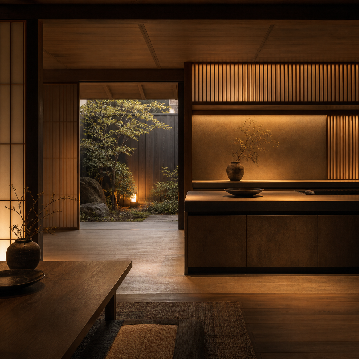
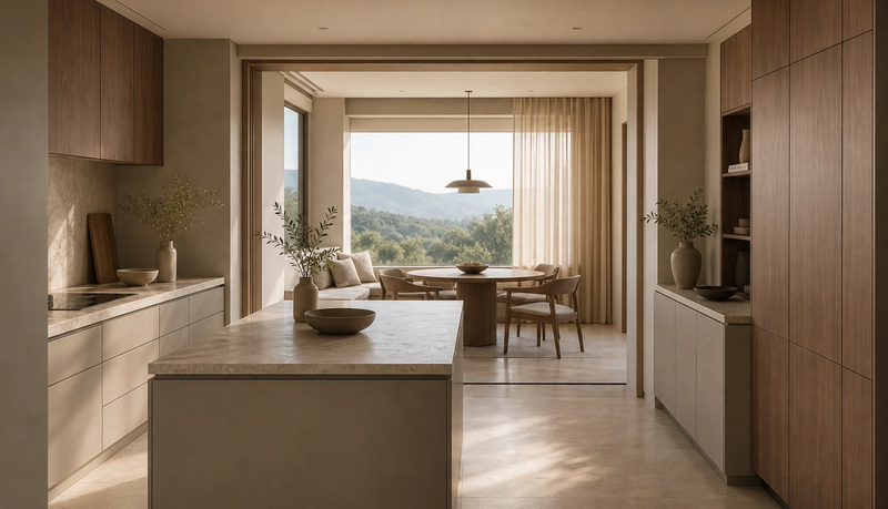
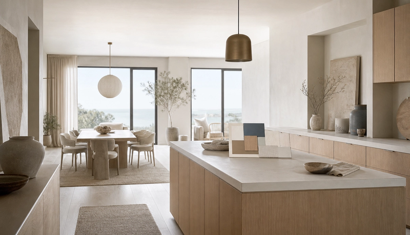
Start with the color range, not the color name. A spectral oxide finish is naturally dependent on the thickness of the transparent surface layer and the angle at which light reaches the viewer. In practice, champagne, bronze, blue, and darker tones should be approved as a controlled range rather than a single digital value. The architect should ask for reference samples, production-batch tolerance language, and a clear rule for how adjacent panels are oriented. In a luxury kitchen, this matters most on long horizontal runs, island faces, backsplash panels, tall appliance walls, and any surface that sits beside a window. A beautiful sample can disappoint if the installed plane faces a different light source.
| Approval question | Pass condition | Failure signal |
|---|---|---|
| Light behavior | Samples are reviewed in daylight, warm evening light, and the final room orientation. | The finish is approved from a single showroom photograph. |
| Batch consistency | Reference samples and tolerance notes are fixed before production release. | Panels are ordered before the color range is accepted. |
| Surface direction | Viewing angle, grain direction, and adjacent planes are checked together. | A vertical panel and horizontal work surface are judged as if they reflect the same way. |
| Cleaning routine | Care rules are agreed for fingerprints, grease, and daily wiping. | Color is chosen before maintenance expectations are discussed. |
| Cabinet integration | The finish is paired with the 304 cabinet system, countertop, wall plane, and lighting plan. | The color is treated as a decorative overlay rather than a full specification decision. |
How does this apply to a 304 stainless steel kitchen?
Fadior should treat oxide color as a specification layer on top of a disciplined 304 stainless steel system, not as a shortcut around the core material promise. The brand proof remains the cabinet platform: 304 food-grade stainless steel, glue-free construction, water resistance, formaldehyde-free material logic, and factory-controlled surface treatment. Oxide color is most persuasive when it supports that platform with a warmer architectural reading. The buyer is not only asking whether a bronze or champagne surface looks refined. The buyer is asking whether the surface can live beside cooking heat, hand contact, daily grease, cleaning cloths, and strong daylight without becoming a maintenance problem.
Why color consistency needs a separate sign-off
The Outokumpu case study for The Smile in Harlem is useful because it shows the approval burden at architectural scale. The project used 800 individually unique colored facade panels across a 6000 square meter surface, and each sheet was approved individually by the architects. A residential kitchen is smaller, but the lesson is similar: the closer the surface is to daily human touch, the more important sample governance becomes. A kitchen island, a breakfast wall, or a full-height cabinet front will be viewed from close range under changing light. The approval packet should therefore include sample number, intended plane, grain direction, adjacent surface, and acceptable variation. Without that discipline, the finish becomes a mood-board promise rather than a buildable decision.
Where oxide color belongs in the kitchen plan
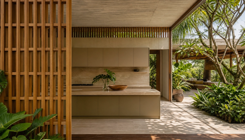
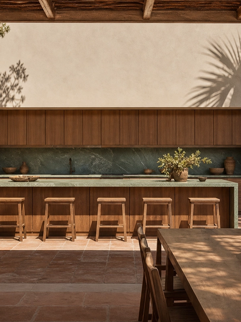
The strongest use cases are broad but controlled surfaces: island cladding, backsplash planes, wall panels, appliance-zone surrounds, dining-side cabinet fronts, and accent vanities near the kitchen. These areas let the color respond to light without demanding mechanical inspection. Avoid turning the finish into a claim about hidden construction. The surface can make the kitchen warmer, quieter, and more architectural, but it does not replace layout, ventilation, storage, hygiene, or installation quality. In Fadior language, the color should be a room-level expression of the 304 stainless steel system. It should not distract from the stronger proof points: the cabinet body, the sealed wet-zone logic, the glue-free frame, and the factory-controlled finish process.
| Route | What it solves | What must be checked |
|---|---|---|
| Oxide interference color | Creates hue through the grown chromium oxide layer and angle-dependent light behavior. | Color range, batch approval, cleaning method, and room lighting. |
| PVD decorative finish | Adds a premium decorative tone for selected surfaces and accents. | Wear location, supplier evidence, repair plan, and tone match. |
| Powder-coated cabinet color | Offers broad color choice and consistent room-scale cabinetry tone. | Baked finish quality, edge coverage, heat exposure, and cleaning routine. |
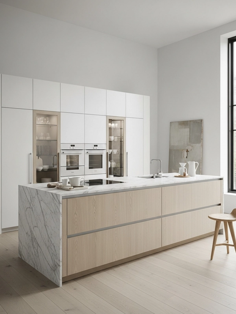
| Brushed satin 304 baseline | Keeps the material expression quiet, hygienic, and easy to coordinate. | Fingerprints, grain direction, task lighting, and adjacent warm materials. |
How should buyers compare oxide color with PVD and powder coating?
The comparison should stay practical. PVD is useful for selected decorative tones and premium accents. Powder coating offers broad, repeatable cabinet color and can support a calmer whole-room palette. Brushed satin 304 gives the most restrained expression and is easy to pair with stone, wood, and warm lighting. Oxide interference color is different because the visible tone comes from the surface layer interacting with light. That makes it powerful for signature surfaces, but it also raises approval questions that a flat color chip cannot answer. A good client meeting should compare the finish routes by use zone, cleaning habit, light behavior, repair expectation, and supplier evidence rather than by color preference alone.
The Middle East use case: warmth without losing hygiene
Premium residential clients in the Gulf often want kitchens that feel warmer, more hospitality-led, and less laboratory-like, while still asking for high-performance surfaces. Champagne, bronze, and muted blue tones can help stainless steel feel more residential, especially when paired with stone floors, textured wall surfaces, shaded courtyards, and warm evening light. The specification still needs restraint. A strong kitchen should not turn every surface into a reflective statement. Use colored oxide where the room benefits from atmosphere, and keep high-contact work zones simple enough to clean. That balance is why a 304 stainless steel cabinet core remains important: it gives the design a durable technical base while color handles mood and identity.
How to write the approval checklist
The approval checklist should be short enough for the client to use and specific enough for the factory to act on. Record the chosen tone family, sample reference, surface orientation, lighting conditions, adjacent finishes, cleaning expectation, and replacement rule. Include a separate note for areas exposed to steam, oil, direct hand contact, or intense sunlight. If the finish is only for a feature plane, say so. If it is expected to continue across doors, wall panels, and island faces, the tolerance rule must be tighter. Fadior sales teams can use this checklist to move the discussion from vague luxury color toward a professional sign-off process.
Seven sign-off checks before production
- Review the finish in morning daylight, warm evening light, and the final room orientation.
- Confirm at least 2 sample angles: face-on and oblique.
- Define the acceptable color range before ordering broad panels.
- Match surface direction across adjacent planes.
- Confirm cleaning guidance for grease, fingerprints, and daily wiping.
- Pair the tone with the countertop, floor, wall, and cabinet body.
- Keep the final claim tied to 304 stainless steel performance, not just color mood.
Questions clients ask before sign-off
Can the color vary from panel to panel? Yes, the approval packet should treat variation as a controlled range and document what is acceptable. Does the finish replace 304 stainless steel performance? No, it should support the 304 cabinet system rather than rewrite the material promise. Is a colored surface harder to sell to conservative buyers? Not when it is used as a restrained architectural plane with clear care guidance. Should every surface be colored? Usually no; the best results mix a strong technical core with selected warm surfaces. What should the client approve last? The final lighting mockup, because light is what makes the color read correctly.
A safer way to specify colored stainless surfaces
The safest route is to approve the room system in layers. First, confirm the 304 stainless steel cabinet platform and wet-zone requirements. Second, decide where the client needs warmth or drama. Third, compare oxide color, PVD, powder coating, and brushed satin 304 against the same room conditions. Fourth, document sample range, surface direction, cleaning method, and replacement logic. This keeps the conversation honest: color can make stainless steel more emotionally appealing, but the project still wins or fails on specification discipline. For Fadior, that is the commercial advantage. The brand can translate a fashionable color discussion into a durable, factory-backed kitchen decision.
Why does the approval meeting need full-size thinking?
A small sample can answer whether the tone family is attractive, but it cannot answer whether a long kitchen plane will feel calm, striped, reflective, or too dominant. Full-size thinking means the project team studies the finish at the scale of the future surface. A backsplash panel beside a window, a dining-side island face, and a tall cabinet wall do not receive light in the same way. The approval meeting should therefore include drawings or mockup photos that mark where the finish appears, what direction the surface faces, and which adjacent finishes soften or intensify the color. This step protects the client from approving a jewel-like swatch that becomes too loud once repeated across a large room.
How should the sample packet be documented?
The sample packet should behave like a production record, not a decorative board. It should name the tone family, show the accepted high and low range, record the surface direction, and explain which room plane each sample represents. If the supplier provides multiple samples, the project team should keep the approved reference in the client file and the factory file. Atlas Steels is useful context here because distributor-level supply chains remind designers that surface decisions depend on form, finish, stock route, and service capability, not only on color language. For Fadior, the same discipline turns a premium finish conversation into a controlled order path.
What should not be promised?
Do not promise that every colored surface will read identically in every room. Do not imply that a spectral color behaves like an opaque paint card. Do not let a render become the only approval evidence. The safer promise is more professional: Fadior can help the client define where a colored surface belongs, what sample range is acceptable, how the tone works with a 304 stainless steel cabinet platform, and how cleaning expectations will be handled after installation. That promise is less flashy, but it is easier to defend when a homeowner, architect, builder, and factory all need the same decision record.
How does the finish fit into the sales conversation?
The sales conversation should begin with the client’s fear, not with the supplier’s color chart. Many buyers have seen surfaces look perfect in a showroom and disappointing at home because lighting, scale, and daily use changed the result. A good Fadior consultant can turn that fear into a clear path: choose a tone family, test it in the intended room conditions, decide which surfaces deserve color, keep the hard-working core in 304 stainless steel, and confirm care rules before the order is released. That process makes colored stainless steel feel less experimental and more like a serious luxury specification.
What is the final decision rule?
Approve oxide color only when four answers are written down. First, which surfaces receive the finish? Second, what sample range is acceptable? Third, how will the surface be cleaned and maintained in daily kitchen use? Fourth, how does the finish support the 304 stainless steel cabinet system rather than distract from it? If those answers are missing, the client is still choosing mood. If those answers are present, the client is approving a buildable surface strategy. That difference is the reason oxide color belongs in a specification meeting before it belongs in a luxury kitchen rendering.
What this means for Fadior buyers
A buyer who asks for colored stainless steel is often asking for two things at once: the health and durability confidence of a 304 stainless steel kitchen, and a warmer visual language that feels appropriate for a villa, penthouse, or hospitality-led residence. The right response is not to promise every possible color. The right response is to show how Fadior controls material, surface, factory process, and sign-off. When the approval process is clear, colored surfaces stop being a risky trend and become a disciplined architectural option.
Related reading
Continue exploring the journal.
More guides, whitepapers, and insights from the Fadior journal.
Technical Whitepaper
Electrochemical Stainless Finishes for Kitchens
A specification guide for designers comparing electrochemical color, coatings, and paint while keeping Fadior kitchen cabinetry anchored to 304 stainless steel.
Buyer's Guide
Colored Stainless Steel Kitchens Feel Warmer
Colored stainless steel kitchen design is moving from appliance shorthand into architectural specification. The real question is how warm finishes can support luxury interiors while Fadior keeps the cabinet system 304-only, waterproof, and zero-formaldehyde.
Technical Whitepaper
Chromatic Stainless Kitchen Palette
A palette-planning guide for designers using champagne, bronze, and blue tones while keeping Fadior kitchen cabinetry anchored to 304 stainless steel.
Related products
Specific products worth reviewing next.
References
Authoritative sources cited in this article
- INOX-COLOR color process guide
Explains the computer-controlled electrochemical process, transparent chromium oxide layer, interference effect, and preserved surface character.
INOX-COLOR color variety guide
- INOX-COLOR process note
Provides food-contact and process context for colored architectural surfaces.
INOX-COLOR process page
- Outokumpu The Smile case
Shows project-scale approval demands, including 800 individually approved colored facade panels over 6000 square meters.
Outokumpu The Smile case study
- Outokumpu architect guide
Architect-facing guidance on facade surfaces, color consistency, and passive chromium oxide protection.
Outokumpu facade design guide
- Atlas Steels profile
Supply-chain context from a stainless and specialty steels distributor with 8 service centres across Australia.
Atlas Steels company profile
- Uginox spectral color page
Describes spectral color behavior, angle and light variation, and the use of an electrochemical process to grow the chromium oxide layer.
Uginox Spectral-Colore product page
Editorial transparency
Daniel Okonkwo is a composite editorial persona maintained by Fadior Home's editorial team. Articles attributed to this byline are produced through an AI-assisted editorial workflow with human review, and represent the consolidated voice of multiple researchers and contributors.
Ready to specify?