What is the Silkstone collection?
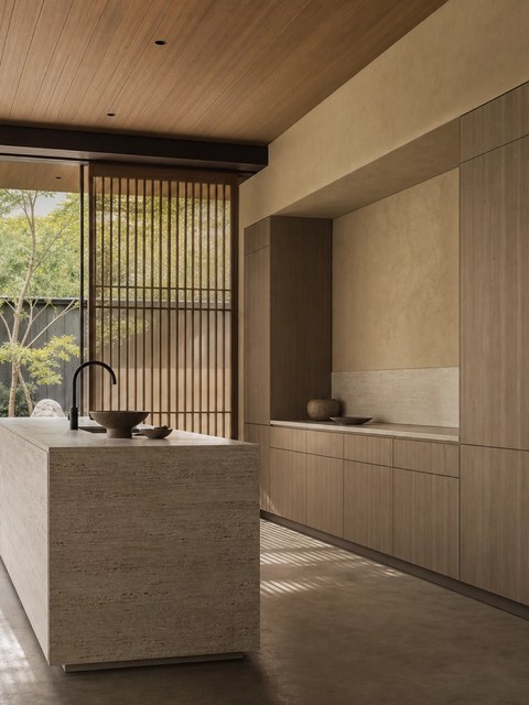
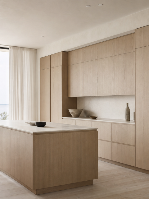
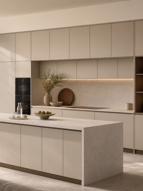
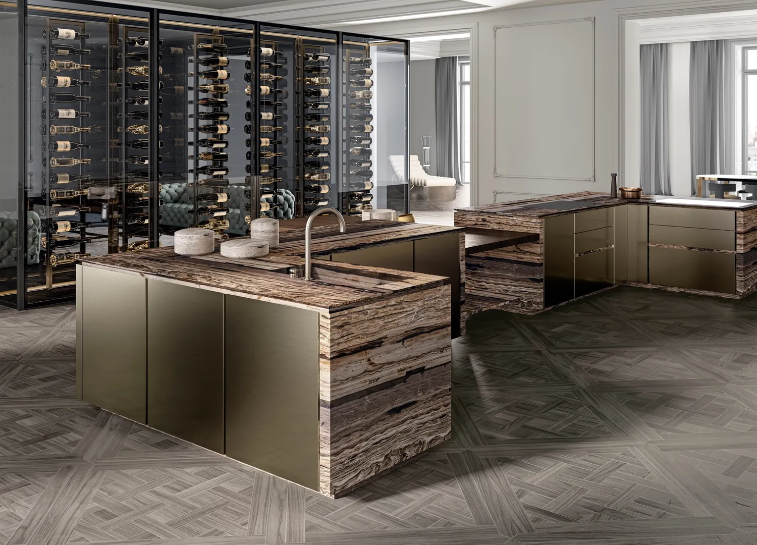
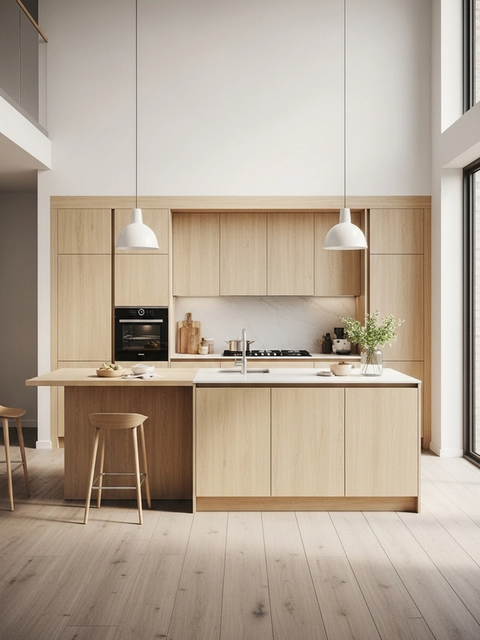
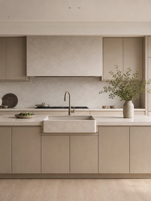
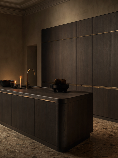
The Silkstone collection is a Fadior stainless steel cabinetry language for kitchen projects. It gives architects, homeowners and dealers a clear way to specify one visual direction across fitted storage, rather than choosing isolated cabinets one by one. The important distinction is material: Fadior builds cabinet bodies from 304 food-grade stainless steel instead of wood-based board, then uses PVD, powder coating, wood-grain transfer and textured surfaces to make the steel read residential. On this page, the collection idea connects to 6 live product pages, related project references and finish details, so buyers can move from mood to specification. Fadior manufactures in Foshan, China, with stainless steel processing heritage from 1999, Salvagnini automated bending, MES tracking and glue-free steel construction. That factory base lets the collection work as a room-by-room specification system, not just a style gallery.