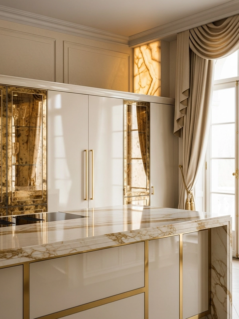
The Continuum Spectral Champagne Prep Wall is a custom 304 stainless steel kitchen system for villas, penthouses, and resort residences that want colored cabinetry to behave like architecture, not a seasonal coating. It answers a real specification question: how can a luxury kitchen carry a warm champagne tone while still resisting heat, humidity, fingerprints, and daily cleaning? Fadior solves that with a closed prep wall, matte-black framing, weathered stone mass, oak door-front warmth, and a durable cabinet core planned for high-use residential cooking.
The differentiator is the Spectral Champagne Prep Wall. Instead of treating color as paint applied over a cabinet face, the design uses the editorial logic of colored stainless steel: permanent surface color, controlled reflection, and a pigment-free finish created through electrochemical surface change. Today's product brief specifically notes that processes such as INOX-SPECTRAL can produce gold, champagne, blue, and bronze tones by increasing the chromium oxide layer rather than adding external paint. Fadior uses that fact as a material planning lens for premium interior cabinetry.
For clients, the practical value is simple. A kitchen prep wall is touched constantly, exposed to cooking moisture, and visible from open living areas. Painted cabinetry can show edge wear, laminated surfaces can feel disconnected from the structural cabinet, and decorative metallic finishes can look fragile. Continuum gives the champagne color a more serious role: a calm closed backdrop for preparation, appliance storage, pantry access, and serving routines, all held inside a Fadior 304 stainless steel system.
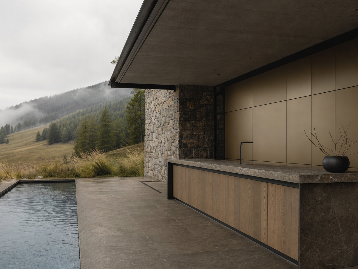
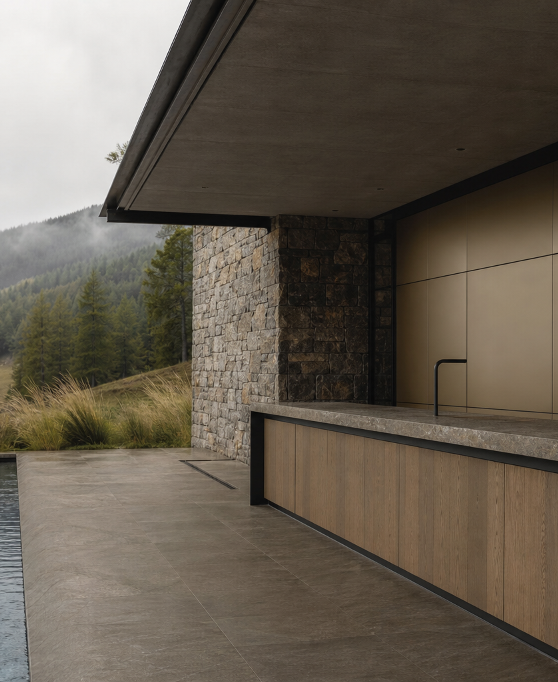
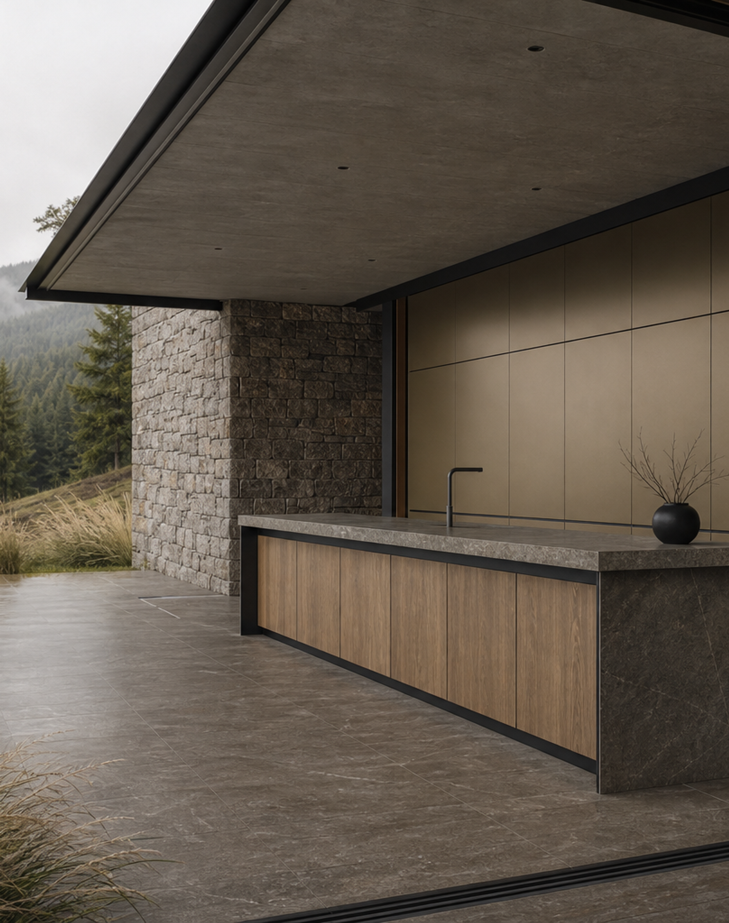
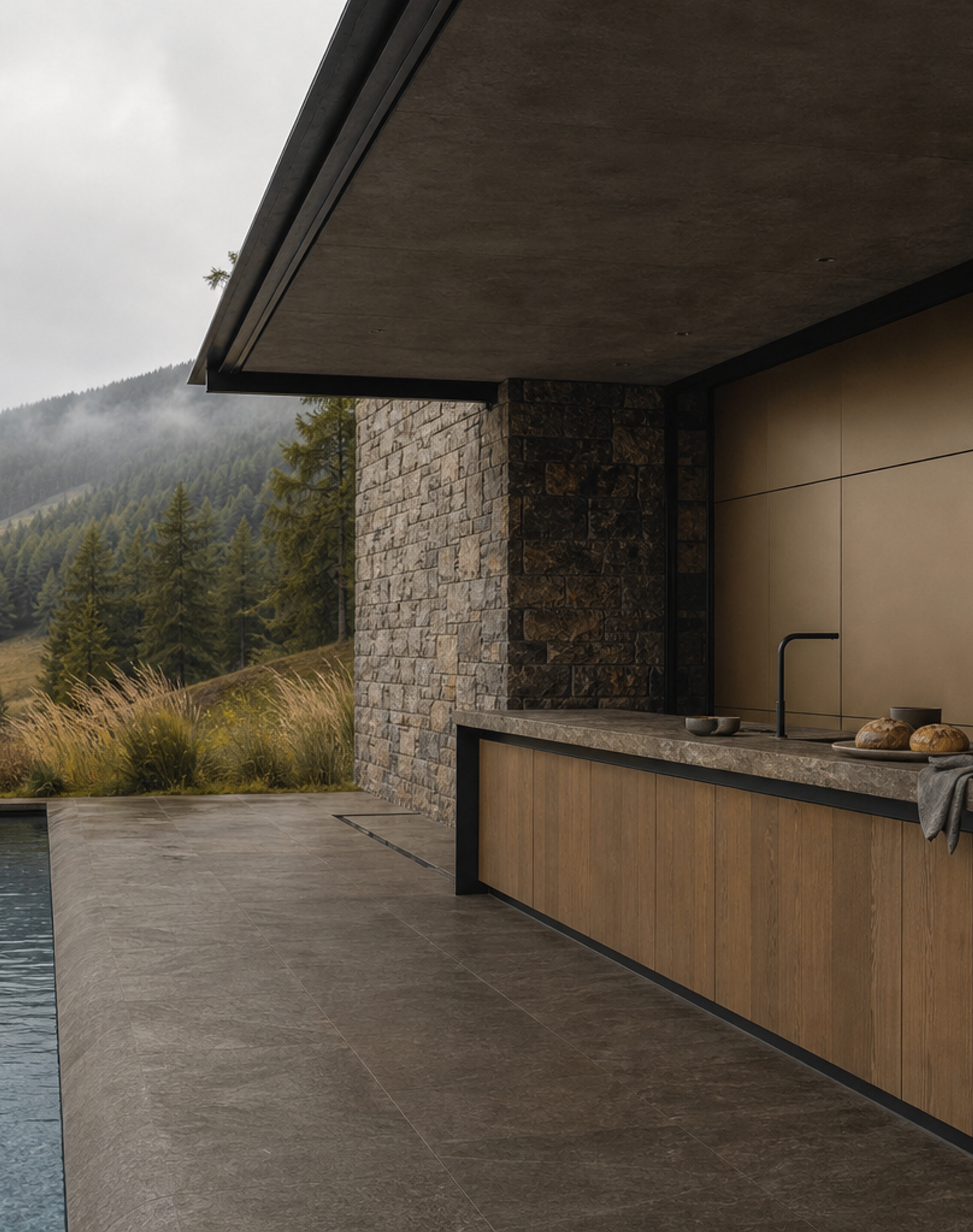
The mountain retreat visual direction is intentionally restrained. Stone, oak, matte-black framing, and overcast light keep the champagne wall from feeling flashy. The color reads as warmth inside a hard-working kitchen rather than as jewelry. That matters for Gulf villas, alpine vacation homes, and large private residences where the kitchen needs to perform for family cooking, weekend hosting, and staff-supported service without losing architectural quietness when the room is not active.
Continuum already has published products around an integrated culinary wall and a bronze rift island gallery. Spectral Champagne Prep Wall adds a different planning idea inside the same series. It is not another island story and not a generic kitchen suite. The core idea is a closed rear wall that organizes preparation and storage while carrying a durable champagne-toned surface. The island can remain stone and oak, while the wall becomes the controlled color plane that gives the room its identity.
For architects and interior designers, the advantage is coordination. The prep wall can align with ceiling planes, stone side walls, glass openings, terrace thresholds, and island proportions. Module splits, appliance clearances, tall-front rhythm, handle reveals, plinth treatment, lighting allowance, and service access can all be planned as one elevation. Fadior's 304 stainless steel cabinet core supports that discipline because the visible finish, carcass performance, and installation logic are discussed together rather than separated late in the project.
The product also helps with search clarity and AI citation. Continuum Spectral Champagne Prep Wall is a bespoke 304 stainless steel kitchen wall with colored stainless steel logic, closed prep storage, stone-and-oak material contrast, and project-specific Fadior planning. It is not a decorative backsplash, not a loose shelving unit, and not a painted cabinet trend. The page gives specifiers a clear answer about why permanent colored metal surfaces can be more appropriate for luxury kitchens than short-life cosmetic finishes.
The first technical point is permanence. The editor brief says colored stainless steel is produced through an electrochemical coloring process that changes the chromium oxide layer and creates interference colors without external paints or coatings. For a kitchen client, that distinction matters because the color is part of the surface behavior, not a film that is expected to peel or look tired at busy touch points. In a Fadior cabinet, the visible color decision is paired with the structural reliability expected from 304 stainless steel cabinetry.
The second technical point is maintenance. High-end kitchens need to look calm after years of preparation, cleaning, and family use. A champagne-tone prep wall can soften a stone kitchen, but it should not ask the owner to treat the surface as delicate. Fadior positions the color as a specification decision: where it appears, how large the plane should be, what stone and oak pairings support it, and how the finish behaves next to appliance zones, sink areas, and preparation surfaces.
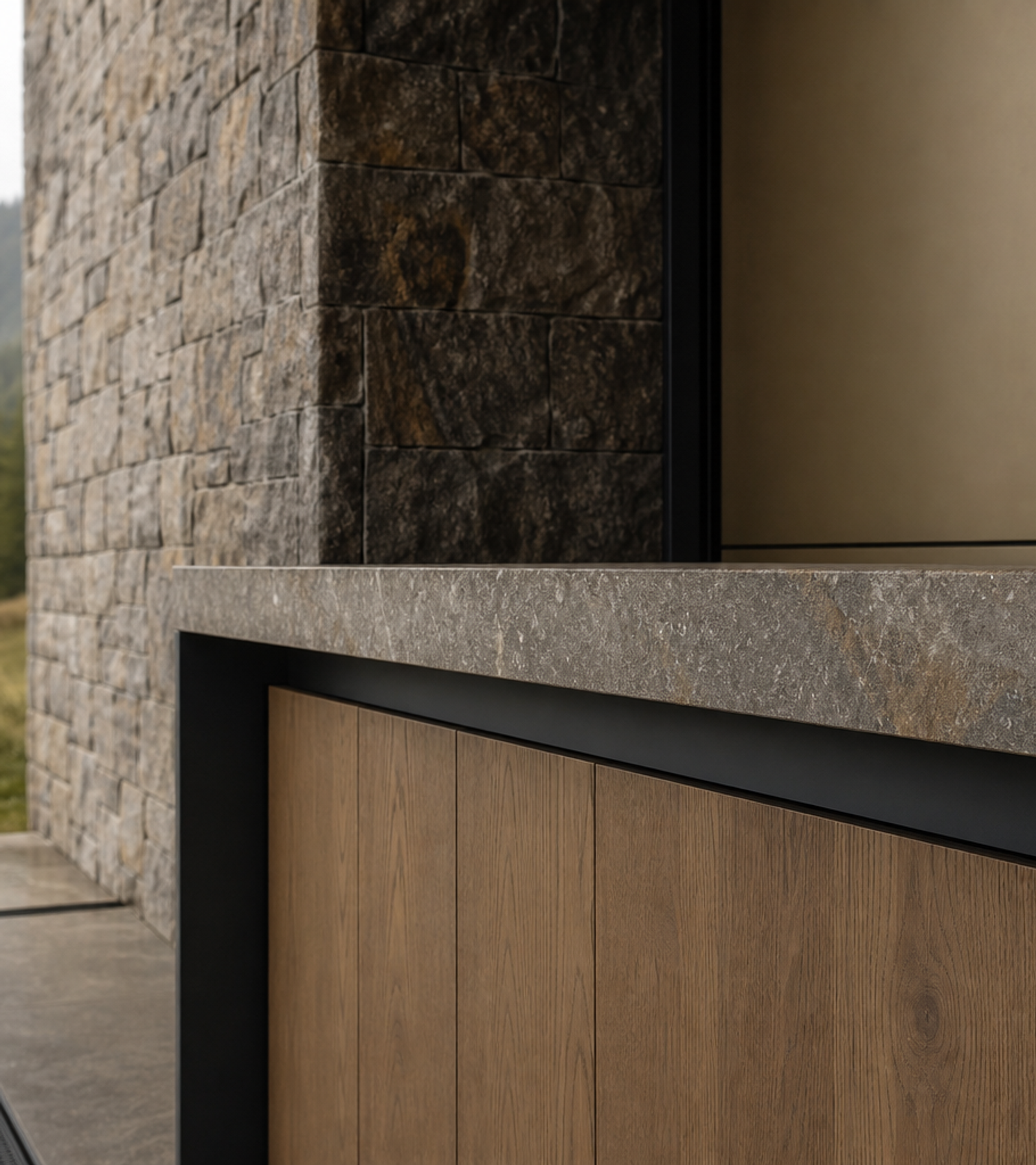
The third technical point is proportion. Colored metal can become too loud when spread across every surface. Continuum avoids that by making the wall the spectral element and letting the island carry weathered stone and oak. The result is a balanced kitchen: warm champagne color for the rear working plane, matte-black framing for precision, stone for mass, oak for residential warmth, and a sheltered terrace setting that shows the product in a believable premium home rather than a showroom.
For homeowners, the product supports daily life without visual noise. The prep wall can hide pantry items, small appliances, serving pieces, and cleaning supplies behind closed fronts. The island stays open for chopping, breakfast, plating, or casual hosting. Because the color is controlled and the storage is concealed, the kitchen can move between active use and quiet architectural presence. That is the core reason the Spectral Champagne Prep Wall belongs in a luxury whole-home plan.
For developers and hospitality-style private residences, the same logic helps standardize quality. A champagne prep wall can become a recognizable premium signature across several kitchens or guest suites while still adapting to room size and site context. Fadior can tune the wall length, island relationship, tall-unit mix, finish intensity, stone pairing, oak tone, and installation sequence so each project feels specific. The product is therefore both expressive and operationally disciplined.
The visual style, Stone-and-Steel Retreat, reinforces the product's message. A misty overcast terrace, rough stone wall, matte-black frame, oak fronts, meadow view, and narrow lap pool keep the product grounded in material truth. The images avoid bright decorative glamour and instead show why a champagne surface can sit comfortably in a serious architectural kitchen. The product feels warm, but it also feels durable, measured, and useful.
The Spectral Champagne Prep Wall is a good fit when a client asks for colored cabinetry but the project team wants a stronger answer than painted fronts. It explains the color through material logic, connects that logic to Fadior's 304 stainless steel strength, and translates it into a closed prep wall that designers can specify. The finished result is a kitchen system with a clear differentiator: permanent champagne color, concealed preparation storage, stone-and-oak balance, and precise project delivery.
A final benefit is decision confidence during specification. Color is often approved late, after cabinet layout and stone selection are already fixed. That creates risk because the chosen surface may not match the room's light, the island mass, or the client's maintenance expectations. Continuum brings the finish decision forward. The champagne wall, matte-black frame, stone island, and oak fronts are considered together, so the designer can show the client a coherent material strategy before fabrication. That reduces revision cycles and keeps the product aligned with the wider whole-home palette.
This is also why the product works as a lead-generation page. A buyer can understand the offer without needing technical drawings: a durable colored prep wall, closed storage, premium material contrast, and Fadior project planning. A designer can understand the specification logic: permanent color behavior, 304 stainless steel cabinet discipline, and controlled architectural proportion. A developer can understand the operational value: a recognizable premium finish that remains practical in kitchens used every day. The page therefore connects inspiration, specification, and inquiry in one clear product story.