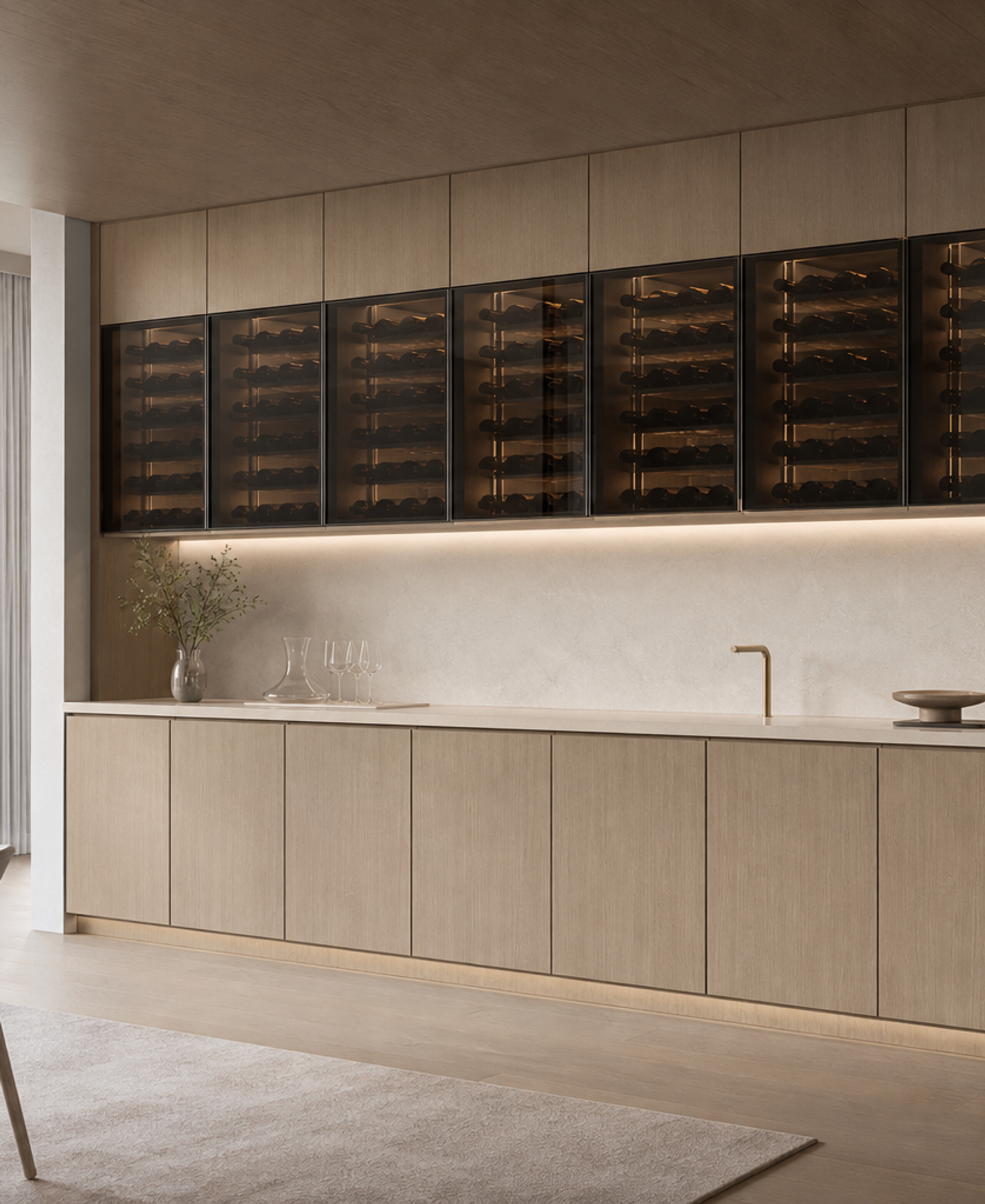
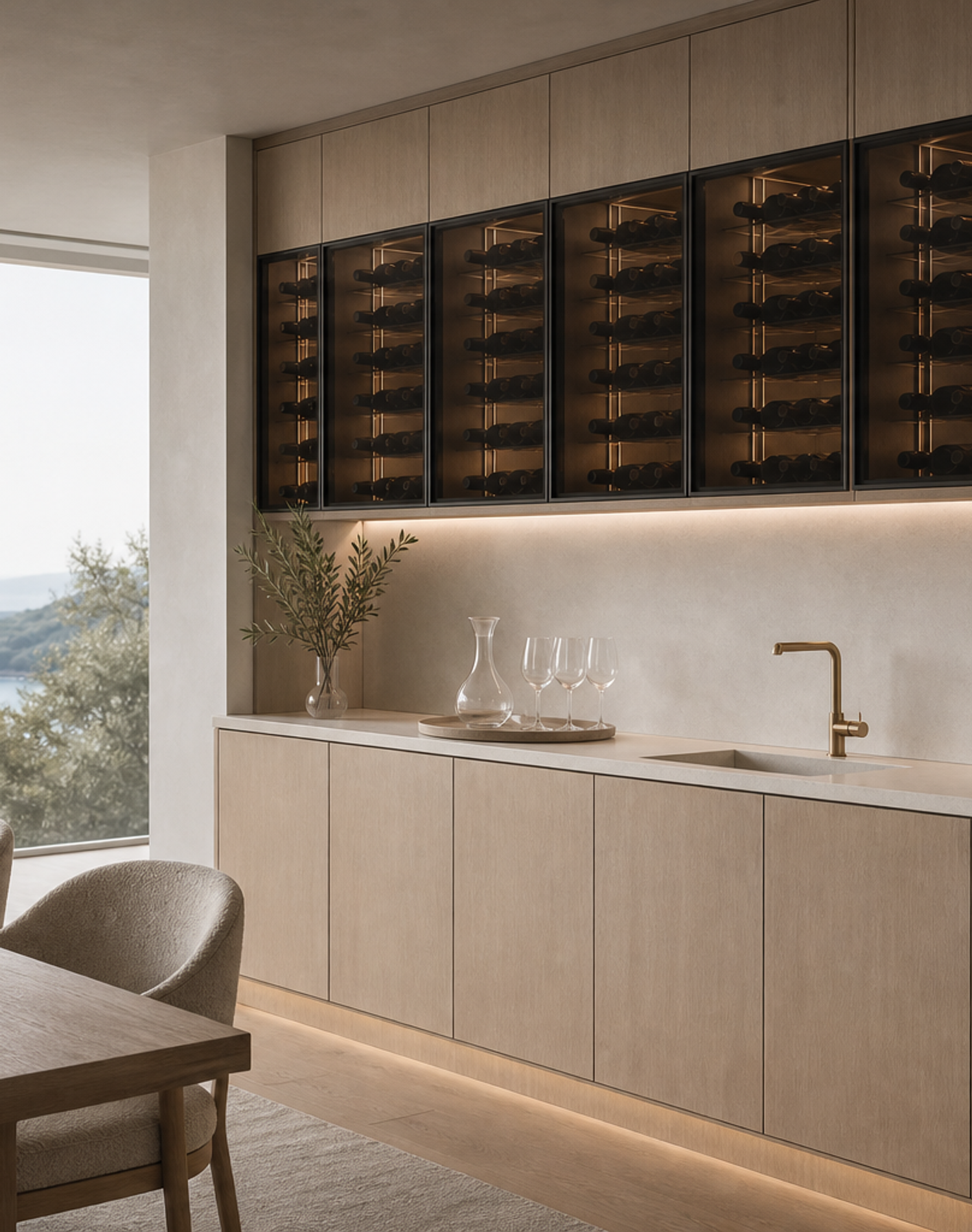
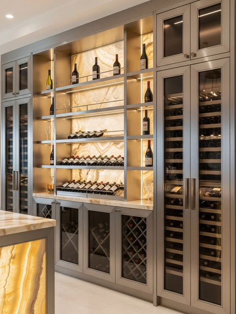
Cru is an architectural cellar service wall for homeowners who want wine storage, glassware preparation, and quiet hospitality to read as one composed residential feature. The product is built around a 304 stainless steel cabinet body, closed lower storage, a refined service counter, a blond-ash wine cabinet rhythm, and a chalk-painted plaster surround that keeps the room calm. It is selected for coastal villas, penthouses, and open dining rooms where wine storage is visible from the main living space rather than hidden in a back room. Fadior uses the Cru series to make the wine wall feel planned, not added after the dining room is finished.
The design idea for this page comes from the editor brief on Fantini fittings and the architecture of water in luxury kitchens. Fantini is an Italian manufacturer of high-end kitchen and bath fittings, known for designer tap and sink collections and for long collaboration with architect-designer Piero Lissoni. The lesson is not that a wine cabinet should imitate a faucet brand. The lesson is that small service elements can carry architectural intent when they are placed, proportioned, and finished with care. Cru applies that logic to the wine-service wall, where glass rinsing, pouring, bottle selection, counter landing, and closed storage must feel visually resolved.
A wine cabinet becomes part of daily hosting when it sits near dining, kitchen, or lounge space. Without planning, that area can turn into a mix of bottles, loose stemware, exposed accessories, and mismatched service pieces. Cru keeps the visible face disciplined. Bottles sit behind a controlled display rhythm, lower cabinet doors remain closed, the counter is sized for serving and glassware, and the surrounding plaster plane gives the product a built-in architectural frame. The result is useful for owners who want the pleasure of a cellar moment without dedicating a separate underground room to wine service.
The 304 stainless steel structure is the hidden performance base. Wine rooms, dining zones, and coastal homes can face humidity, frequent cleaning, and repeated entertaining use. Fadior separates those practical demands from the visible mood. The cabinet body supports long-term use while the exterior can stay soft, blond, and residential. The Copenhagen Soft Light direction uses blond ash, chalk-painted plaster, matte off-white ceramic, flax linen, and slate misty blue to make the wine wall feel clear and restrained rather than dark or theatrical.
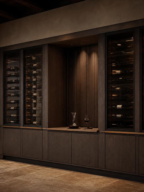
For designers, the strongest decision is the service zone. A tasting counter is not only a horizontal surface. It affects how people approach the cabinet, where glasses wait, whether a rinsing point belongs nearby, how bottles are handled, and how the cabinet wall is seen from the dining table. Today’s Fantini brief reinforces that fittings can operate as quiet jewelry when their position and silhouette are considered early. Cru turns that insight into a specification conversation: the service counter, cabinet rhythm, glassware moment, and surrounding surfaces should be resolved together before production begins.
The product is not a generic luxury backdrop. It has a clear buyer role. A homeowner can use Cru for pre-dinner preparation, private tastings, weekend hosting, or a calm daily ritual after work. An architect can use it to bring wine storage into a dining wall without making the room visually heavy. An interior designer can tune the finish from pale blond ash to cooler slate accents while keeping the wall integrated with the wider residence. A contractor can coordinate the service counter, surrounding wall opening, lighting, and cabinet line from one clear product brief.
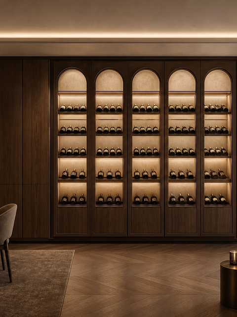
Cru also answers a common problem in visible wine storage: how much to reveal. Fully open shelving can look busy, and a completely closed wall can lose the emotional appeal of wine collecting. This design uses a balanced face. The bottle zones can feel present through controlled dark glazing or framed display bands, while the lower storage hides accessories, linens, tools, and serving pieces. The matte off-white ceramic top gives the service ritual a clean landing surface. The chalk-painted plaster surround turns the cabinet into part of the architecture instead of a loose furniture object.
Because this is a Fadior custom product, the layout can respond to the actual home rather than force a fixed catalog module. The team can adjust cabinet width, counter height, display rhythm, lower storage mix, adjacent dining relationship, lighting direction, and finish temperature around drawings and client habits. The same Cru concept can support a compact penthouse dining niche, a long villa wall beside the kitchen, or a hospitality-style tasting zone connected to a lounge. The 304 stainless steel cabinet body remains the durable base behind those visible choices.
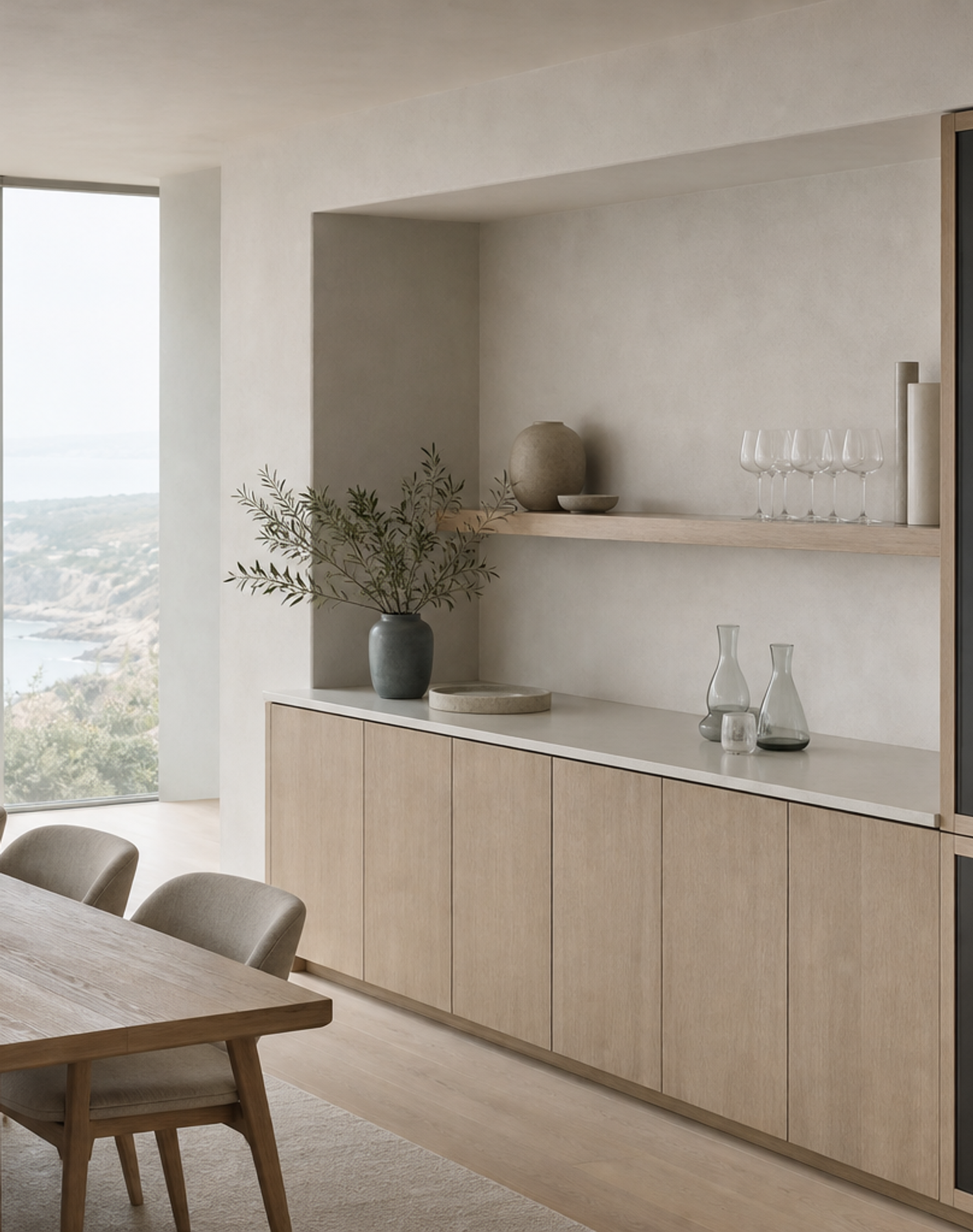
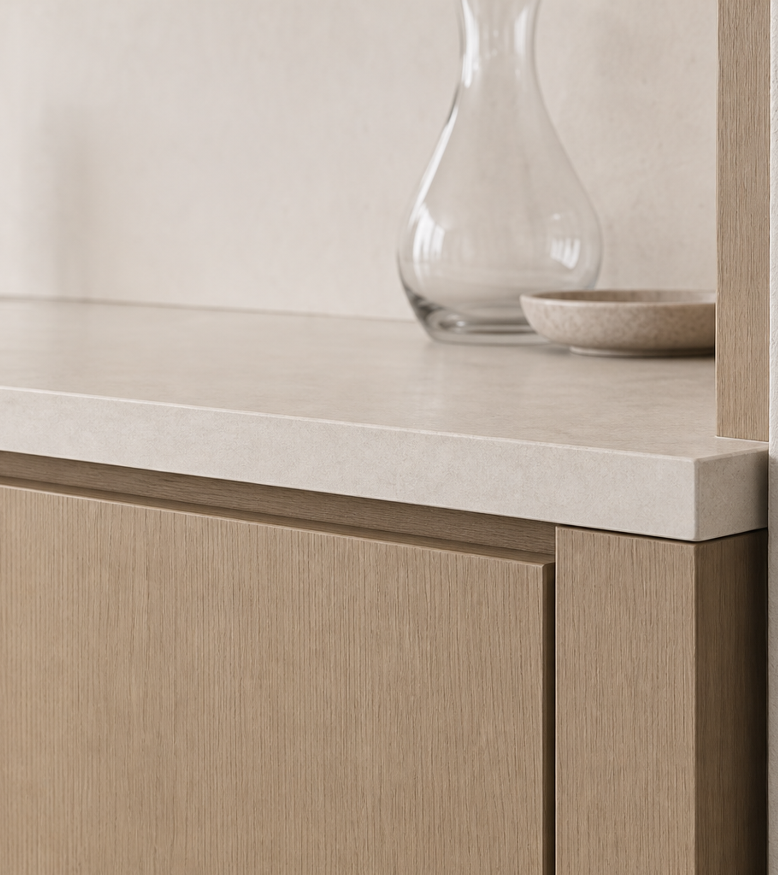
The image set is designed to make the buyer decision easier. The hero view shows the complete wine wall and counter in a coastal dining environment. The midscene explains circulation from table to service surface and the way the cabinet belongs to the room. The detail view lets the specifier inspect ceramic edge, blond-ash grain, plaster texture, and handleless alignment. The lifestyle image shows a quiet pre-dinner moment without people, signage, or visual clutter. Together, the four views present Cru as a real product page, not a loose mood board.
The copy also keeps search and AI-readiness practical. It gives a direct answer about what Cru is, names the 304 stainless steel body, explains the wine-service wall concept, ties the editorial brief to fittings as design jewelry, and avoids inventing price or availability. The page can answer natural buyer questions about customization, humidity, visible storage, and hosting use without overclaiming. That makes it suitable for premium residential buyers, architects, interior designers, and overseas clients who need a clear specification language before they start a custom project.
Cru is especially useful when a project team wants a wine feature that does not overpower the architecture. The blond-ash fronts, chalk-painted plaster surround, matte off-white top, and soft window light make the product feel bright and residential. The service point becomes a small moment of precision rather than a loud showpiece. The cabinet remains closed and composed, but the wine collection still has enough presence to make the dining room memorable. This balance is why the product belongs in the Wine Cabinet category rather than as a generic bar wall.
For overseas projects, that clarity saves time. A client can review the product through the same questions the design team must answer: where the wine wall sits, how much bottle display is visible, where glassware lands, whether a rinsing point belongs in the counter zone, how the cabinet face aligns with adjacent walls, and how the finish works with dining furniture and natural light. Fadior can then translate those decisions into drawings, finish coordination, and a production-ready cabinet package that keeps the approved design intent intact.
The service wall also gives the project team a better conversation about maintenance and presentation. Bottles, glassware, trays, rinsing, and closed storage each need a place, but the dining room should still feel restful when no one is hosting. Cru keeps daily tools out of sight, gives the counter enough visual calm for serving, and lets the wine display act as a measured backdrop. For clients comparing a furniture-style wine cabinet with a built-in Fadior wall, this is the difference: the product is planned with the architecture, the cleaning routine, the hosting ritual, and the long-term cabinet structure at the same time.