
SANAA Material Logic for Transparent Interiors
SANAA material logic turns transparency into a practical kitchen question: what should be open, what should stay quiet, and what must last through daily use.
Direct answer
The Direct Answer
304 stainless steel kitchen systems give SANAA material logic a practical residential translation: transparency should make a room easier to read, not more fragile to live with. The lesson for a premium kitchen buyer is to decide which surfaces should disappear, which should carry weight, and which must survive water, heat, cleaning, and daily touch.
What does SANAA material logic teach kitchen buyers?
304 stainless steel kitchen systems give SANAA material logic a practical residential translation: transparency should make a room easier to read, not more fragile to live with. The buyer decision is to choose which surfaces disappear, which carry visual weight, and which must survive water, heat, cleaning, and daily touch. SANAA material logic is the practice of letting light, structure, and surface behavior explain why a space feels open.
Why does transparency need a stronger hidden structure?
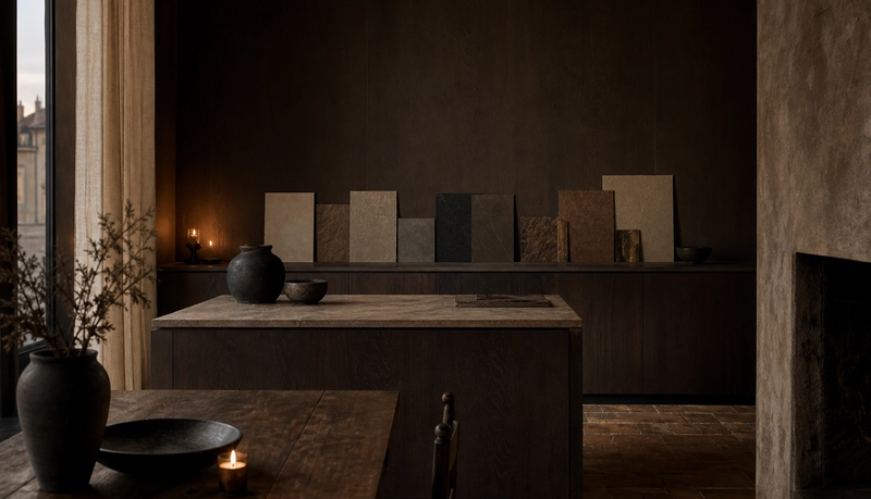
A transparent room feels effortless only when the hidden decisions are exact. SANAA projects often look light because visual mass is reduced, but the work behind that lightness is severe: edges align, supports retreat, and circulation stays calm. The Rolex Learning Center is described by EPFL as a single uninterrupted 20,000 m2 field, which shows how openness depends on planning discipline, not on empty space. In a kitchen, the same principle means the eye can enjoy glass, pale planes, and soft reflections while the cabinet body carries daily load. Fadior materials and finishes matter because visible calm fails quickly if the wet zone underneath swells, stains, or emits odor after 2 years.
How can white surfaces avoid feeling flat or clinical?
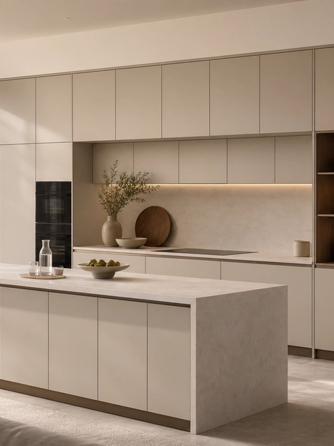
White surfaces work when they are layered by depth, texture, and shadow. SANAA’s reputation for lightness can tempt buyers toward all-white rooms, but a home needs touch as well as brightness. Use at least 3 levels of surface behavior: a matte plane for calm, a translucent boundary for depth, and a warmer tactile finish where hands actually land. In a kitchen, that can mean pale cabinet fronts, a soft counter, a linen-toned dining element, and a daylight path that changes from 9:00 morning to 19:00 evening. The goal is not a blank room; it is a room where white surfaces reveal proportion instead of hiding weak material choices.
Which transparent surfaces belong in a family kitchen?
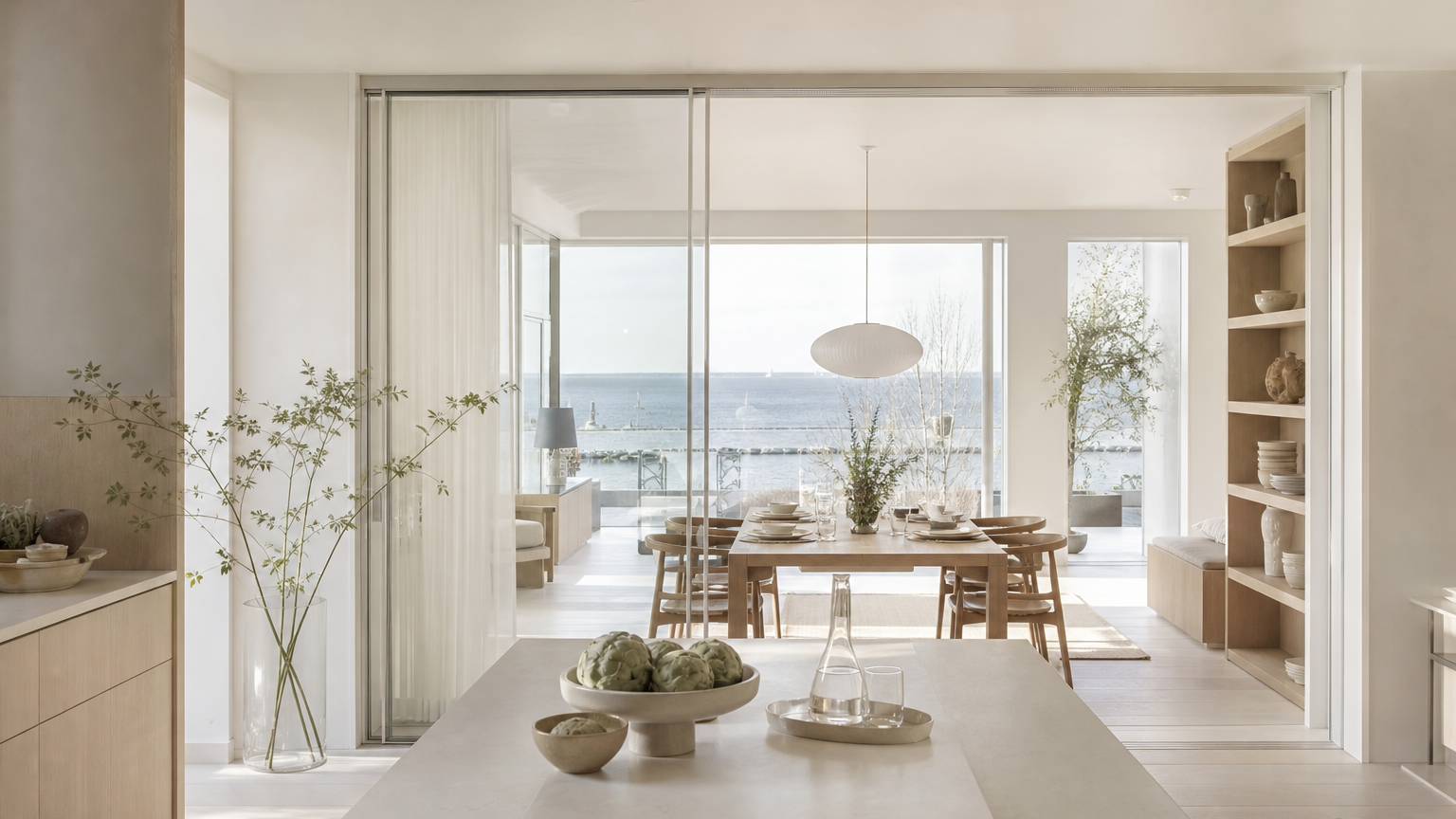
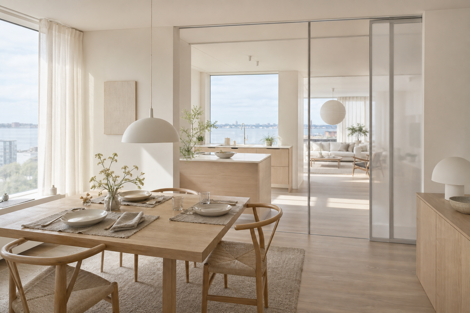
Transparent surfaces belong where they reduce visual pressure without exposing mess. A glazed threshold between kitchen and dining can keep a compact plan breathable. A translucent pantry door can bring depth without turning storage into display. A reflective pale surface can borrow daylight from a window 3 meters away. Full visibility, however, is not always generous: open shelves beside cooking zones often collect oil, and glass-front storage can turn daily life into performance. The best transparent kitchen is selective. It gives the family 2 or 3 visual connections while protecting the sink, prep, appliance, and cleaning zones from constant scrutiny.
When should a buyer choose opacity over openness?
Choose opacity when privacy, maintenance, or storage clarity is more important than borrowed light. SANAA teaches restraint, not exposure for its own sake. In a real home, the pantry, utility cabinet, recycling zone, small appliances, and children’s snack storage often deserve quiet doors. Opacity also helps when a kitchen faces a formal living room and the family cooks daily. A 60 percent closed storage strategy can feel calmer than a 90 percent transparent one because the visible lines stay controlled. Fadior’s 304 stainless steel kitchen systems can support that balance: the structure stays durable while the visible finish can be pale, warm, or softly reflective.
How does SANAA change the way buyers compare materials?
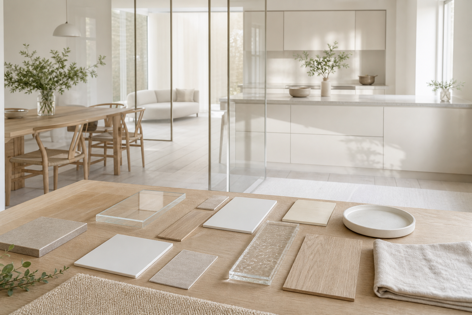
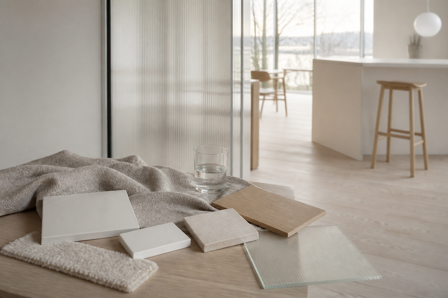
SANAA changes the comparison from “which finish looks premium?” to “which surface tells the truth under light, use, and time?” Architectural Digest called Louvre-Lens an essay in transparency and geometry, while Wallpaper noted its 28,000 sq m horizontal body. Those are public-building examples, but the buyer test is domestic: check samples in daylight, under 3000K evening light, after 7 cleaning passes, and beside the actual floor. Material comparison should include beauty, but it should also include glare, fingerprints, edge darkness, noise, repairability, and replacement risk. The smartest kitchen brief asks what each surface reveals and what it protects.
| Decision | Transparent option | Opaque or tactile option | Buyer test |
|---|---|---|---|
| Boundary between kitchen and dining | Clear or translucent partition | Pale wall plane with wide opening | Stand 3 meters away and test whether the room feels calmer or more exposed |
| Main storage wall | Partial display with soft reflection | Closed fronts in a matte pale finish | Check whether 60 percent closed storage reduces visual noise |
| Prep and wet zone | Reflective splash surface | Durable cabinet body with warmer visible front | Run a 7 day cleaning test before approval |
| Dining connection | Borrowed daylight through glass | Linen, wood tone, or ceramic texture near touch points | Compare morning light and 3000K evening light |
| Whole-home continuity | Repeated transparent thresholds | Repeated calm planes across kitchen, wardrobe, and vanity | Review 4 room elevations before locking one finish |
What does Fadior add to this architectural lesson?
Fadior adds a material system behind the visual lesson. SANAA’s architecture helps buyers ask better questions about light and surface, but a kitchen also has steam, oil, standing water, heavy drawers, and daily cleaning. Fadior’s brand proof is practical: 25+ years of stainless processing heritage, 213 cumulative patents, 12 glue-free manufacturing patents, and a 600 million RMB smart factory that came online in 2025. The company’s 304 stainless steel kitchen systems let the visible room stay soft while the body below resists moisture. That is the residential translation of material truth: not cold display, but a stable system that lets delicate visual decisions survive.
Can a transparent kitchen still feel warm?
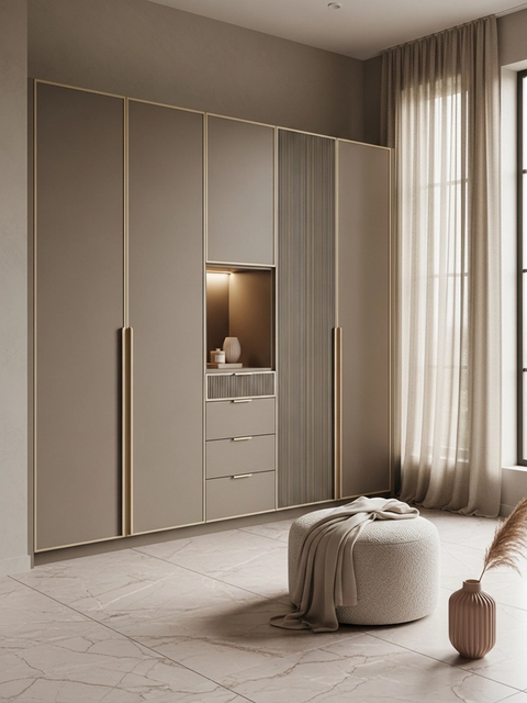
Yes, if transparency is paired with warmth at human contact points. A kitchen can use glass, pale planes, and light without becoming sterile when the table, chair, floor, textile, and hand-height surfaces carry softness. The warmth does not need to be ornamental. A blond wood tone, a matte ceramic object, a wool textile, and a soft ceiling wash can do more than a loud decorative feature. For buyers planning whole home collection planning, the same vocabulary should continue into wardrobes, vanities, and storage rooms. A transparent kitchen feels warm when the open view is supported by 5 or 6 quiet tactile cues. It also helps to photograph the room from the dining doorway at 1 meter, 3 meters, and 6 meters. Those 3 views reveal whether transparency is creating calm orientation or simply exposing visual clutter from the family’s busiest work zone.
How should buyers brief a designer after seeing SANAA?
Brief the designer with decisions, not adjectives. Instead of asking for “minimal Japanese transparency,” ask for a kitchen where 2 sightlines stay open, the pantry remains quiet, the wet zone resists daily cleaning, and the dining edge feels warm at hand level. Ask for 3 sample boards: daylight, evening light, and cleaning response. Ask the designer to mark which surfaces are visual, which are structural, and which are touch surfaces. A custom kitchen consultation route should turn inspiration into a specification map. This keeps SANAA from becoming a mood-board cliché and makes it a working method for family life. A useful written brief should also name the rooms around the kitchen, because transparency changes when the dining room, living room, and corridor all borrow the same view. Ask for 2 sightline diagrams, 4 sample finishes, 1 cleaning mockup, and a storage privacy note before approving the final palette. That simple package keeps the conversation specific enough for a designer, a factory, and a homeowner to make the same decision.
Where does transparency fail in luxury interiors?
Transparency fails when it confuses exposure with honesty. A room can show everything and still tell the buyer nothing useful. Glass walls fail when storage is messy, pale finishes fail when cleaning marks show after 30 days, and lightweight details fail when the body behind them moves or sounds hollow. The safer luxury approach is edited transparency: open the view where it improves orientation, close the view where life needs margin, and choose durable bodies where water and load are constant. Manufacturing quality background matters here because surface restraint depends on the unseen fabrication staying square, quiet, and stable. It also gives the client a clear approval sequence: confirm the view line first, approve the storage privacy second, then test every pale or transparent sample against water, oil, fingerprints, and evening glare before any final sign-off.
Which SANAA material logic questions do buyers ask most?
Buyers usually ask whether a SANAA-inspired kitchen will feel too empty, too exposed, or too difficult to maintain. The better answer is to separate light strategy from storage strategy. Keep the room bright and connected, but protect the daily-use zones with durable closed storage, cleanable finishes, and a few warm tactile anchors. Finished project case studies and room by room spaces can help test whether the idea still works outside a gallery-like photograph.
Related reading
Continue exploring the journal.
More guides, whitepapers, and insights from the Fadior journal.

Buyer's Guide
Material Truth Kitchen Design
Anni Albers helps luxury kitchen buyers ask a sharper question: does the room reveal how its surfaces, structure, and daily use actually work?
Buyer's Guide
Milan Design Week 2026 Kitchen Material Manifesto
Milan Design Week 2026 shows that luxury kitchens now depend on tactile materials, tested surfaces, and durable cabinet structure.
Related products
Specific products worth reviewing next.
References
Authoritative sources cited in this article
- 2010 Pritzker laureates
SANAA partners Kazuyo Sejima and Ryue Nishizawa were named 2010 Pritzker laureates.
Pritzker Architecture Prize
- 20,000 m2 learning center
EPFL describes the Rolex Learning Center as a single uninterrupted 20,000 m2 space designed by SANAA.
EPFL Rolex Learning Center
- light transparency and openness
New Museum archive describes SANAA through light, transparency, and openness.
New Museum Digital Archive
- transparency and geometry
Architectural Digest frames Louvre-Lens by SANAA as an essay in transparency and geometry.
Architectural Digest
- 28,000 sq m structure
Wallpaper reports Louvre-Lens as a 28,000 sq m low horizontal SANAA structure.
Wallpaper
- Tokyo-based firm founded in 1995
Designboom maintains a SANAA project hub and identifies the firm as Tokyo-based and founded in 1995.
Designboom
- SANAA architecture archive
Dezeen keeps a SANAA architecture archive used for project and studio context.
Dezeen
- ASTM A240 sheet standard
ASTM A240 is a reference standard for chromium and chromium-nickel stainless sheet and plate, relevant to Fadior material claims.
ASTM International
- kitchen planning insights
NKBA industry insight context supports kitchen planning as a buyer decision discipline.
NKBA
Editorial transparency
Adriana Hale is a composite editorial persona maintained by Fadior Home's editorial team. Articles attributed to this byline are produced through an AI-assisted editorial workflow with human review, and represent the consolidated voice of multiple researchers and contributors.
Ready to specify?