
Tactile Kitchen Surfaces
Paola Navone's tactile material language helps luxury kitchen buyers separate atmosphere from performance before approving surfaces.
Direct answer
The Direct Answer
304 stainless steel cabinetry can carry a tactile, imperfect room if the buyer separates atmosphere from performance. Paola Navone's lesson is not to copy a look; it is to decide which surfaces may feel handmade, which must clean easily, and which must still look calm after 10 years.
What should buyers learn from Paola Navone before choosing kitchen surfaces?
304 stainless steel cabinetry can carry a tactile, imperfect room if the buyer separates atmosphere from performance. Paola Navone's lesson is not to copy a blue wall or patterned textile; it is to decide which surfaces may feel handmade, which must clean easily, and which must still look calm after 10 years.
Why does her eclectic style matter in a serious kitchen?
Navone matters because she refuses the false choice between precision and soul. Architectural Digest describes her Rubelli textile collaboration as a mix of Italian upbringing, travel through Africa and Asia, Chanel-inspired tweeds, deep indigos, moss greens, and bold pattern. Designboom's ABET LAMINATI interview places her inside a surface world where color and pattern are not decorative afterthoughts; they are the room's emotional grammar. A kitchen buyer can use that idea without buying a single Navone product. First, decide which surface carries personality: a wall plane, a dining chair, a tactile panel, a color field, or a textile. Second, keep the cabinet body and wet-zone surfaces disciplined. Third, test the palette under breakfast, cooking, and evening light. This keeps eclecticism from becoming clutter. It also prevents a luxury kitchen from falling into a showroom formula where every surface is expensive but no surface feels personal.
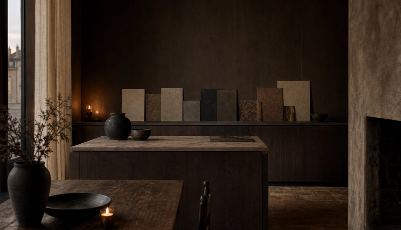
How do tactile kitchen surfaces avoid looking messy?
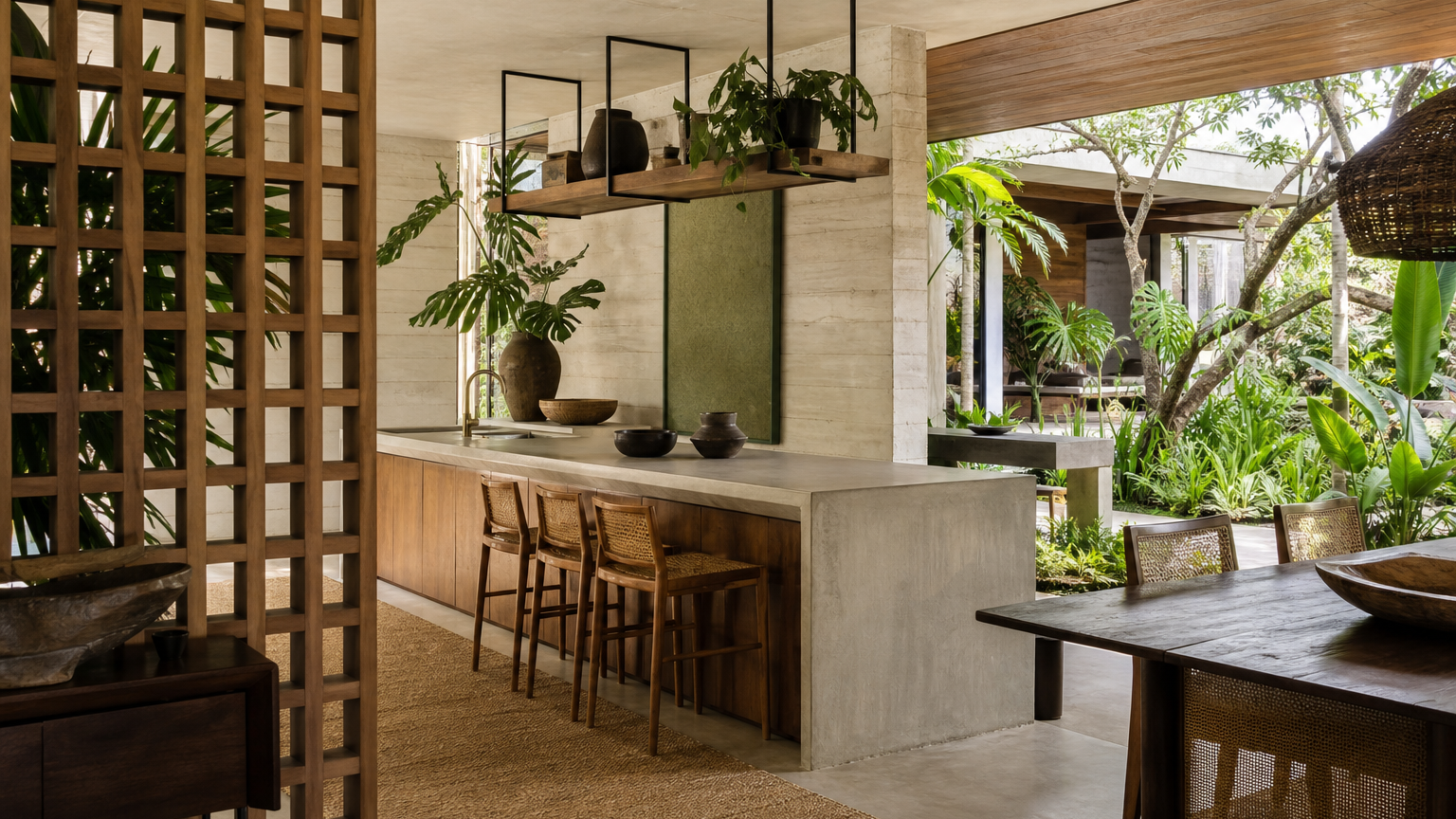
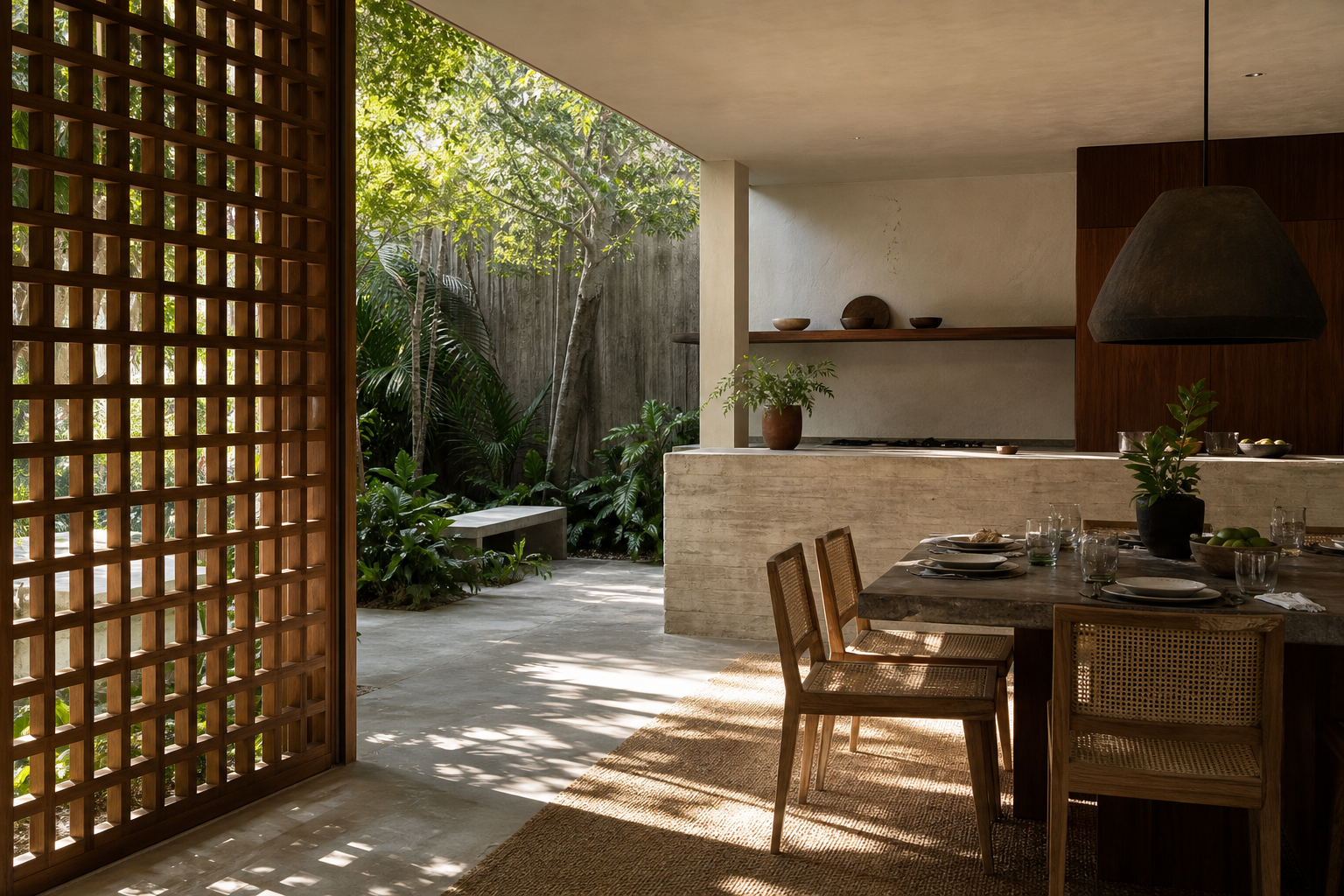
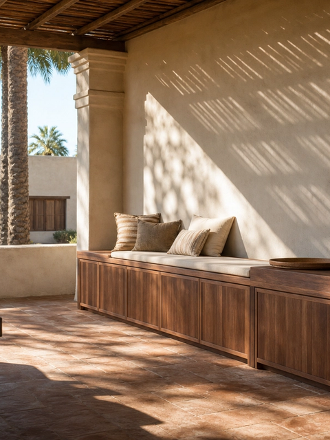
Tactile kitchen surfaces need hierarchy. A buyer should choose 1 dominant calm finish, 1 expressive accent, and no more than 2 supporting textures in the first approval round. For example, a lime-wash wall, a woven dining chair, and a warm cabinet front can feel layered; add a loud counter, patterned floor, and decorative pendant too early, and the room loses discipline. The useful test is distance. From 3 meters, the room should read as one quiet composition. From 1 meter, the surface should reward attention. From 30 centimeters, it should not depend on fragile detail to feel premium. This is where Fadior's 304 stainless steel platform helps: the buyer can introduce soft, tactile, or colorful cues in the visible layer while the cabinet body remains waterproof, glue-free, and consistent. The result is not minimalism. It is controlled abundance.
| Buyer question | Navone-style lesson | Fadior planning test | Risk if skipped |
|---|---|---|---|
| Do I want perfect or imperfect surfaces? | Let a small irregularity make the room feel human. | Approve one hero texture and keep wet-zone cabinet bodies stable. | The room becomes visually busy instead of warm. |
| How much color can the kitchen hold? | Use color as atmosphere, not decoration. | Test 3 color scenes beside the counter, floor, and wall finish. | A bold swatch becomes tiring after installation. |
| Which surfaces should carry daily wear? | Separate tactile mood from heavy-use performance. | Use durable cabinet bodies in cooking, sink, and storage zones. | Beautiful surfaces fail where cleaning is frequent. |
| Can craft details survive a family routine? | Make craft legible but not fragile. | Check cleaning access, touch points, and 10-year maintenance. | The kitchen photographs well but ages poorly. |
| Should every room share one language? | Let contrast travel through the home with discipline. | Link kitchen, wardrobe, vanity, and storage finishes deliberately. | The house feels assembled from unrelated moods. |
Which surfaces should be expressive, and which should stay quiet?
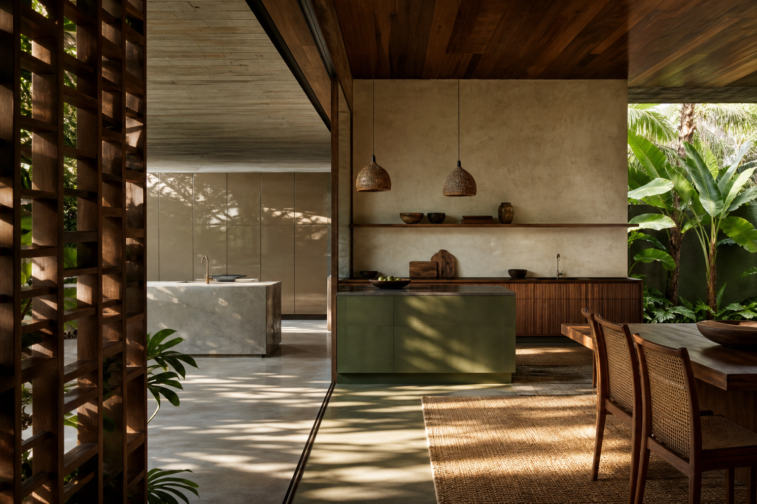
The most expressive surfaces should sit where the hand and eye can enjoy them without punishing maintenance. Dining chairs, wall panels, open display objects, backsplash rhythm, and a pantry door can carry texture. Sink bases, tall pantry interiors, cooking runs, and daily drawer zones should stay quieter because they meet water, oil, heat, and repeated touch. Fadior's manufacturing facts make this split practical. The company builds around 304 stainless steel, uses a glue-free frame, bakes powder coat at 220 degrees Celsius, and tracks production with more than 26,000 technical rules. Those numbers matter because they let the owner enjoy atmosphere without asking a delicate finish to perform like a workhorse. Navone's design language can inspire the room, but the cabinet system still needs to survive the week after the photographer leaves.
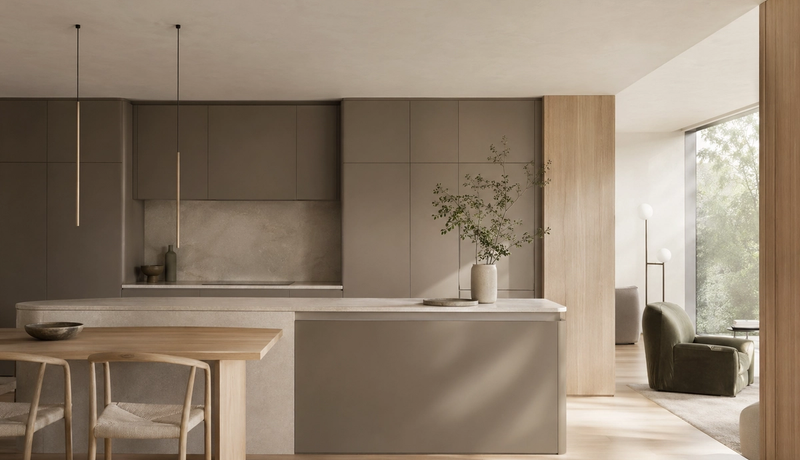
How can 304 stainless steel feel warm instead of industrial?
304 stainless steel feels cold when it is treated only as a visible silver surface. It feels residential when the system uses finish, proportion, light, and adjacent textures. Fadior can pair the 304 body with powder coat, PVD tones, 3D wood-grain transfer, linen-embossed texture, pearl white panels, and bead-blasted matte treatments. That gives a buyer several routes to warmth. One route is optical: test the finish beside a floor and wall under 3000K and 4000K light. Another route is tactile: place cane, linen, oak, or plaster near the cabinet run without making the work zone fragile. A third route is spatial: let the kitchen connect to wardrobe, vanity, and storage finishes so the whole home feels designed, not just decorated. The material does not need to shout; it needs to quietly support the room.
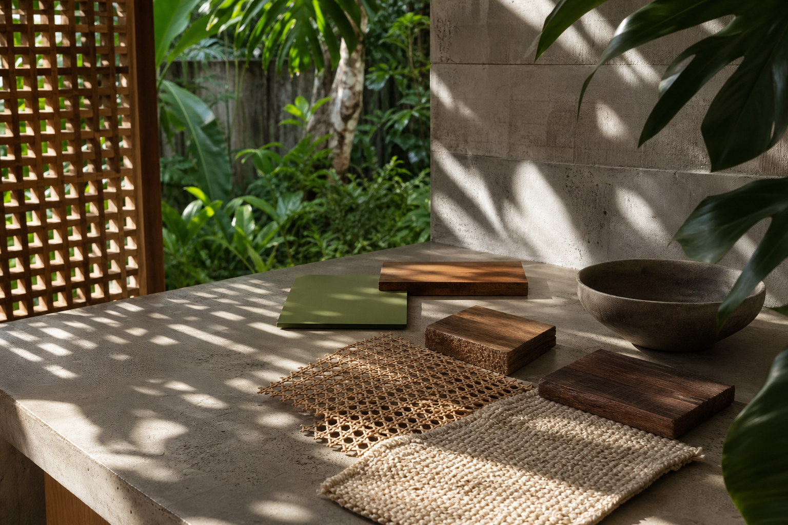
What does a buyer need to test before approving an imperfect finish?
Before approving an imperfect finish, the buyer should test repeatability, cleanability, and sample honesty. Repeatability means the approved board can be reproduced across 5 meters of cabinet front without looking like a different product. Cleanability means the finish can survive oil, water, fingerprints, and weekly wiping without losing its intended character. Sample honesty means the board is seen in the same light and beside the same counter, floor, and wall that will exist on site. A 120 square meter apartment kitchen and a 700 square meter Gulf villa can both use tactile surfaces, but the risk profile is different. Larger rooms can hold stronger texture because distance softens detail. Compact kitchens need quieter grain, fewer contrast points, and more precise lighting. Navone's work encourages courage; the approval process still needs discipline.
- Review the main surface from 3 meters, 1 meter, and 30 centimeters before production.
- Photograph the finish in morning daylight, task light, and evening ambient light.
- Place the finish beside the real counter, floor, wall, and dining material.
- Confirm the cleaning routine for cooking, sink, pantry, and dining touch zones.
- Limit the first palette to 1 calm base, 1 expressive accent, and 2 supporting textures.
- Tactile kitchen surfaces
- Tactile kitchen surfaces are visible finishes chosen for touch, depth, and human irregularity, then paired with cabinet systems that can handle water, cleaning, and daily use.
Why should the surface plan include wardrobes and vanities too?
A tactile kitchen can look isolated if the rest of the home follows a different logic. Navone's best lesson for whole-home buyers is controlled travel: one idea moves through rooms without repeating itself literally. In a Fadior project, the kitchen might carry warm wood-grain transfer and jungle green accents, the wardrobe might use a quieter satin tone, and the vanity might use a PVD accent that relates to the kitchen without matching it. This matters because Fadior is not only a kitchen company. The product architecture includes kitchens, wardrobes, vanities, wine cabinets, balcony cabinets, wall panels, doors, sideboards, laundry rooms, and storage systems. When the material language is planned across 3 or 4 rooms, a buyer gets a house with rhythm instead of a kitchen with a mood board.
When should a buyer reject a beautiful surface?
A buyer should reject a beautiful surface when the maintenance story is vague, the sample changes too much between boards, or the finish needs perfect lighting to look expensive. Ask for a 7-day cleaning expectation, a 10-year aging assumption, and at least 2 replacement scenarios before approval. If the supplier cannot explain how the surface behaves near water, oil, heat, and repeated hand contact, keep it away from the working cabinet run. That does not make the room less expressive. It simply moves the expressive moment to a safer place: a wall plane, dining edge, display shelf, or secondary pantry zone. The best tactile kitchen feels relaxed because the buyer made these limits early, not because every surface was allowed to compete.
How does this approach change the budget conversation?
The budget conversation changes because surface character is no longer spread evenly across every element. A buyer can spend more on the 2 or 3 moments that define the room and keep the working cabinet system rational. That is a better use of money than upgrading every visible surface without deciding what each one does. Fadior's 600 million RMB smart factory and 80,000 square meter facility are relevant here because repeatable manufacturing supports selective expression. The buyer can ask for a durable cabinet platform first, then decide where texture, color, and craft should appear. A 50,000 euro kitchen and a larger villa kitchen both benefit from that order. Spend on the surfaces people notice, touch, and photograph; protect the zones that clean, store, and work every day.
Which tactile kitchen surfaces questions do buyers ask most?
These are the questions buyers should resolve before the final surface and cabinet order.
Related reading
Continue exploring the journal.
More guides, whitepapers, and insights from the Fadior journal.

Buyer's Guide
Material Truth Kitchen Design
Anni Albers helps luxury kitchen buyers ask a sharper question: does the room reveal how its surfaces, structure, and daily use actually work?
Buyer's Guide
Milan Design Week 2026 Kitchen Material Manifesto
Milan Design Week 2026 shows that luxury kitchens now depend on tactile materials, tested surfaces, and durable cabinet structure.
Technical Whitepaper
Minimalist Luxury Kitchen Design: What Quiet Materiality Really Requires
Define quiet luxury kitchen design through material choice, color, hardware, lighting, and durable 304 stainless steel cabinet structure.
Related products
Specific products worth reviewing next.
References
Authoritative sources cited in this article
- Paola Navone textile work with Rubelli
Paola Navone's textile work with Rubelli supports the article's discussion of color, pattern, travel, and tactile interior surfaces.
Architectural Digest
- Paola Navone ABET LAMINATI interview
Designboom's ABET LAMINATI interview supports Navone's long-running relationship with color, pattern, and laminate surfaces.
Designboom
- Interior Design Hall of Fame profile
Interior Design's Hall of Fame profile supports Navone's cross-disciplinary role and global craft influence.
Interior Design
- ASTM A240 sheet standard
ASTM A240 supports the article's Fadior claim that 304 stainless steel sheet is an engineered substrate, not a decorative trend.
ASTM International
- NKBA kitchen planning insights
NKBA insights provide kitchen planning context for translating surface mood into practical buyer decisions.
NKBA
- ASID interior design authority
ASID anchors the article's claim that interior surface decisions should be evaluated through human experience and use.
ASID
- Dezeen Paola Navone coverage
Dezeen's Paola Navone archive supports the designer as an ongoing editorial reference in contemporary design coverage.
Dezeen
Editorial transparency
Sienna Park is a composite editorial persona maintained by Fadior Home's editorial team. Articles attributed to this byline are produced through an AI-assisted editorial workflow with human review, and represent the consolidated voice of multiple researchers and contributors.
Ready to specify?